A few yearâ€ s ago I was out and about and ended up in one of those Halloween Super Stores. I have to tell ya friends, it was a terrifying experience. Don’t get me wrong, I’m all for a little spooky action. But I was totally freaked out by all the ultra creepy masks. Psychotic clowns. Rotting zombie chain saw massacre guy. Random murderers. That creeper from the Saw movies. Besides being totally disturbing I was a little bummed. “Where are the cute costumes?? Who lets their kid dress up as a crazy axe murderer??!†I shook my head, “Itâ€s not like back in the day when we were kids!â€
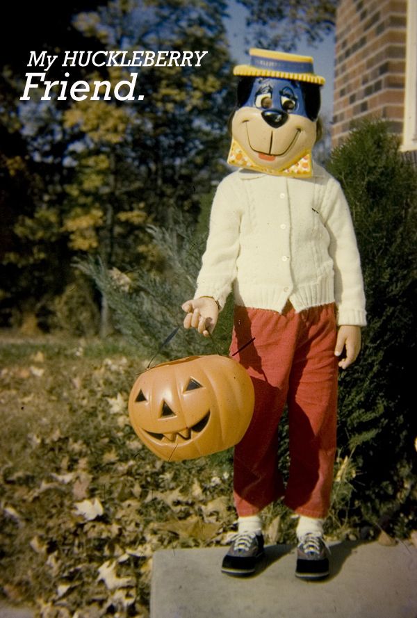
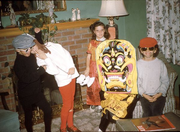
Then again, hold up a second. Maybe I’m not totally remember things correctly. I mean, while most of the costumes back in the day were under the guise innocent characters, most of those old school Halloween masks were positively twisted. Case in point:
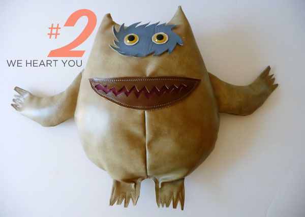
Of course creepy Raggedy Anne is still kinder than the Texas Chainsaw dude. The cheap plastic only adds to the charm. Every year I like to round up some of my favorite Creepy Masks. Here are some of my favorites this year!
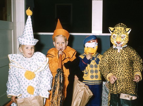
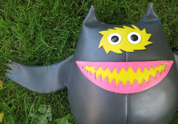
I know people have a problem with clowns, but how can you hate on these two cuties? That duck and leopard are another story. The leopard looks like he (she?) fell victim to the old, “It’s cold outside, you need to wear a coat under that costume!” syndrome.
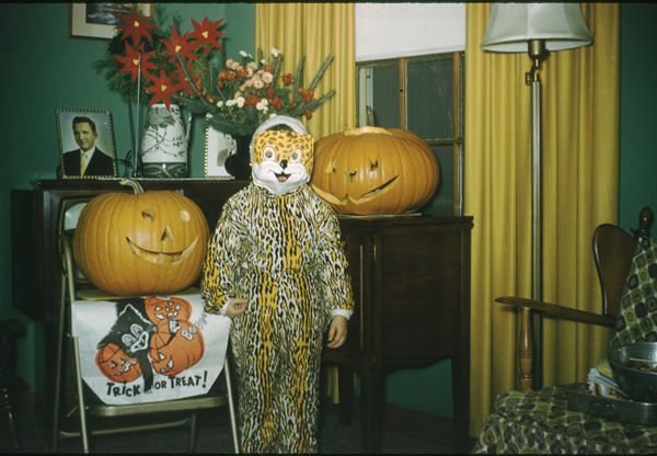
While we’re talking leopard, this is a little more jolly looking….except what’s up with that leering pumpkin??
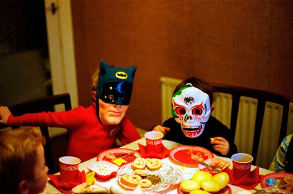
LOVE these guys. Bat Man looks so serious. And the crazy google eyed skull boy, casually munching cookies? Priceless.
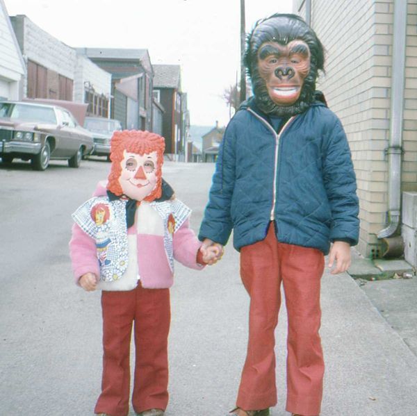
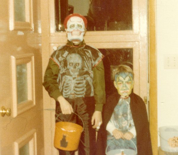
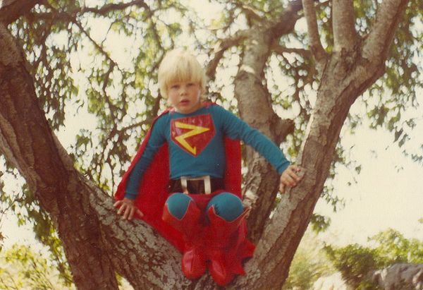
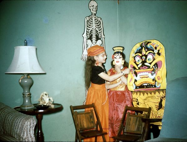
Ahhhhhhhhh! These two would have scared the pants offa me.
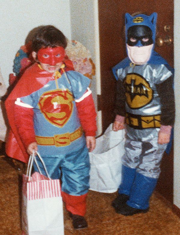
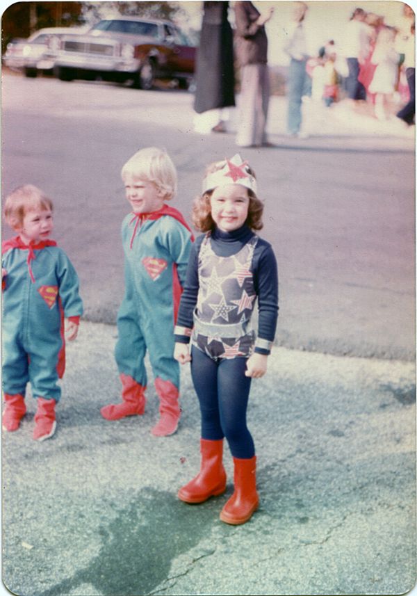
Is it me, or does Superman have a mustache??
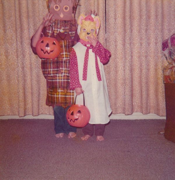
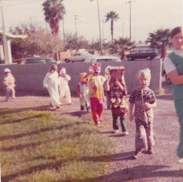
Hurray for the Halloween Parade! You Go, Paper Bag Owl!
I loooooove a good group shot. So much awesomeness going on here. He-Man has such delicate eyebrows. And Zorro is looking positively Zsa Zsa (looks like someone has had a little filler in them thar cheek bones, eh?? ). The lady ghost is so stylish with her little mask….and who is that purple fella? He looks familiar. Hmm.
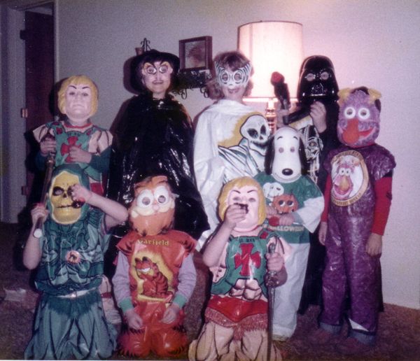
Oh little Snoopy and those sweet little hands….he’s not too happy being next to Skeltor. Or whoever that dude is.
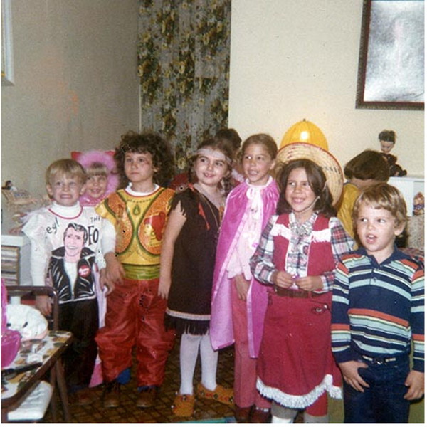
Ayyyyyyyyy!! These kids are all adorable, but I’m reaaallly liking The Fonz. I’m not really liking that creepy doll perched on the right back there.
I want to be Super Friends with THESE cuties!
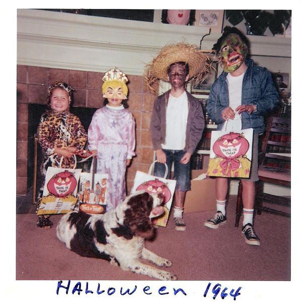
Oh dear. I initially picked this for the faboosh “princess on the half shell” mask….and that werid thing on the end (is he in profile? is he facing straight forward? who knows!). How I failed to notice the, um, “tan” gent in the straw hat, I’ll never know. I’m going to have a little faith and assume he’s supposed to have been vacationing on a tropical island, hence his shoe polish face. Ack. Even the dog looks confused.
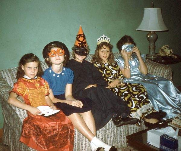
These lovely ladies are adorable….the twin pumpkin mask is so sweet! But I would have killed for the ice blue satin on the end…
This might be my favorite. I love the two beatniks (awesome!). The mantle figurines (rococo AND asian!). The saddle shoes on the snarky girl in the back (adorable). But the Voo Doo Jukebox???? Help me Rhonda!!!
I’m just realizing this is the same house as the girls on the couch! How did we miss the rogue corn cob placed “just so” on that side table??
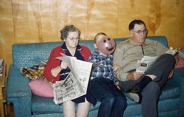
And finally, the winner of the “Phoning It In” award…..
The Halloween Countdown is Officially ON!!!

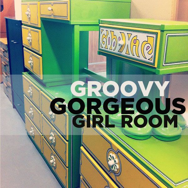
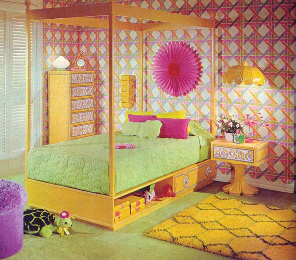
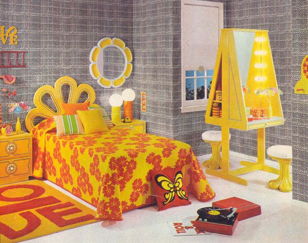
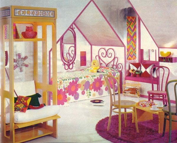
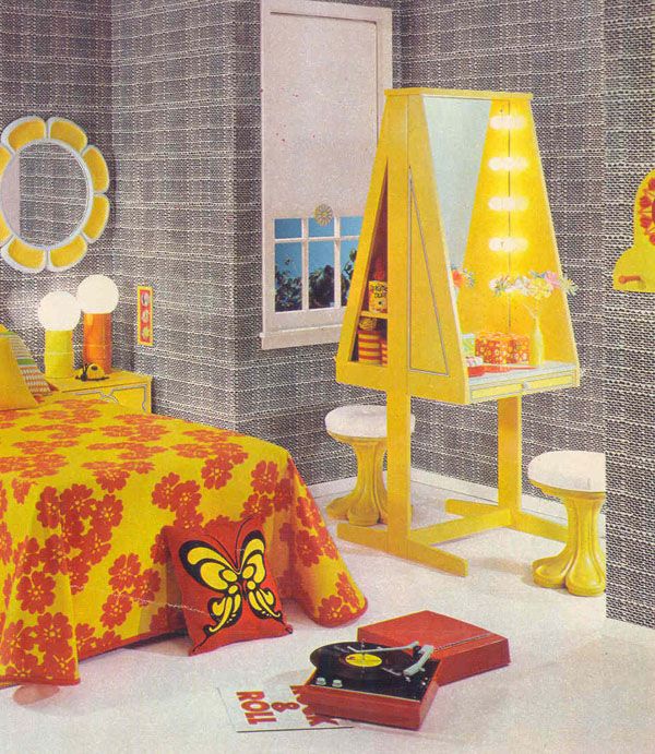
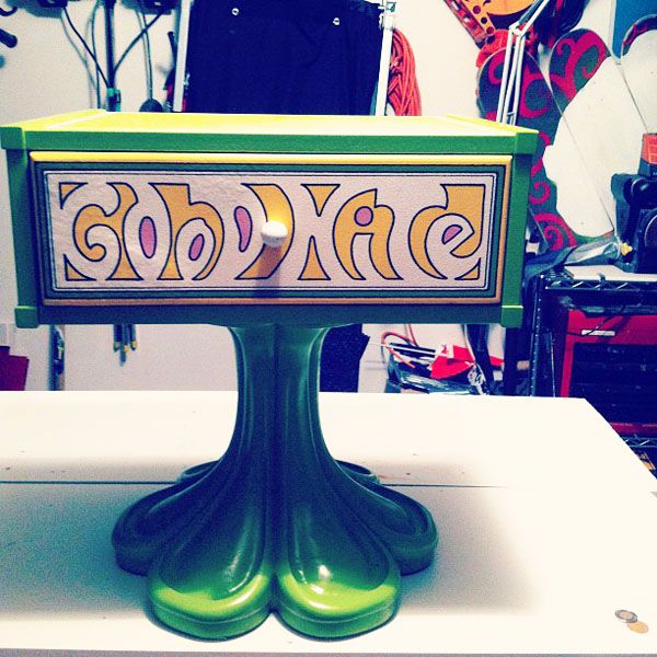
My sweet friend @virginiejolie posted this vintage bedroom set on Instagram a while back. It was in a thrift store she was shopping at and she (and I!) about DIED. This super bright and colorful fun house of a room was made by popular furniture company Drexel back in the 70s. The “Plus One” collection is insane….daisy drawer pulls, kooky cut outs, flower petal pedestals. It’s amazing. And even better? Many of the pieces are labeled, “Desk”, “Bed”, “Telephone” (YES! a phone nook!). And the colors are fun too, of course: “Green With Envy” and “Hello Yellow!”
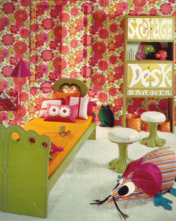
{THE WALLPAPER!!!}
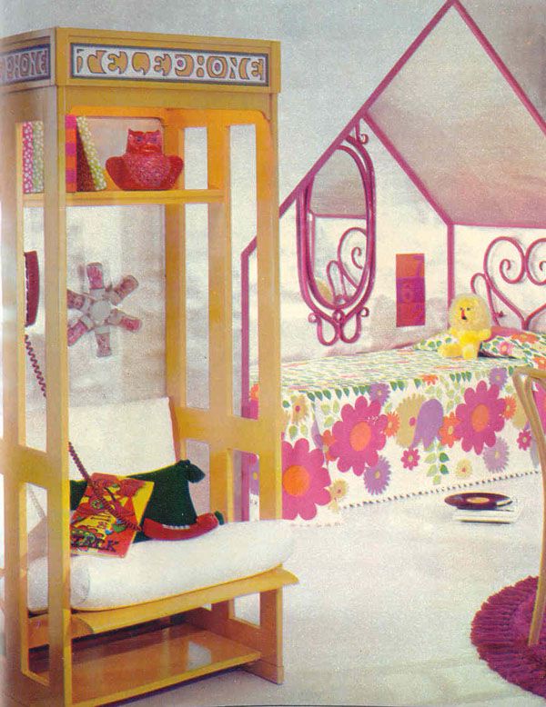
{THE PHONE BOOTH!}
{THE RECORD PLAYER AND LOVE RUG!}
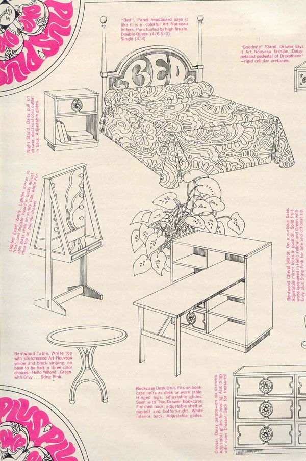
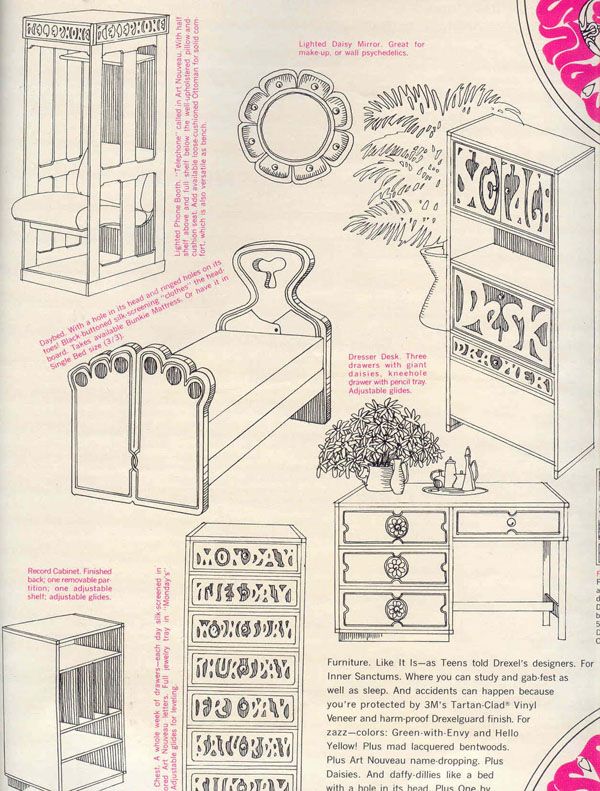
Apparently the set was “designed” by teens (readers of Seventeen magazine who were consulted throughout the process!).
That a-frame vanity??? Oh yes.
{Thanks to Gold Country Girls for scanning those amazing images!}
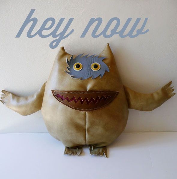
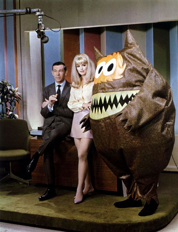
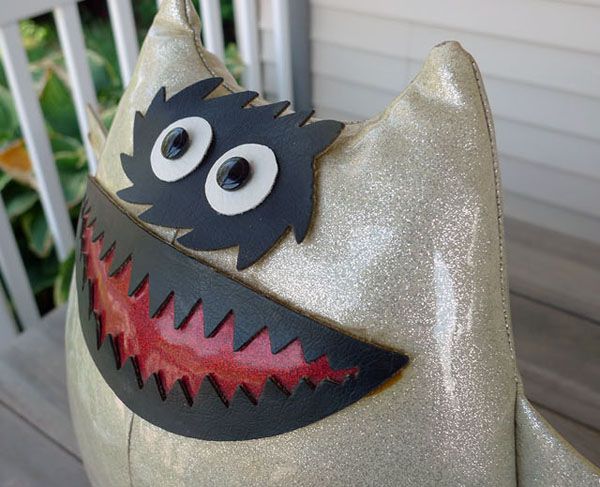
Do you know this goofy fella? Many years ago Greg and I were thrifting and he walked up to me holding this lil guy. He had a quizzical look on his face, “Why do I know this? WHAT is it?” Â I got wide eyed. “What is it??” I shrieked. “It’s a NAUGA!!!” Oh yes, friends. The ever lovin’ Nauga.
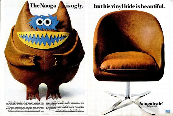
Back in 1936, the UniRoyal company produced a sturdy synthetic leather they called  Naugahyde. It was used on chairs and couches and touted as more affordable and longer lasting option than leather. Fast forward to the 1960s and, in an effort to stand out  amongst the competition, UniRoyal partnered wtih legendary ad man, George Lois to launch a genius marketing campaign worthy of Don Draper.
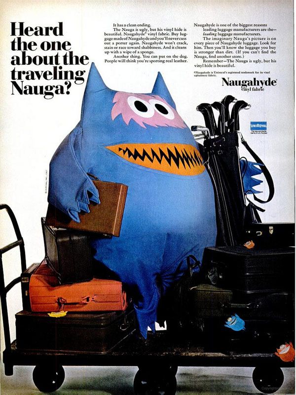
Lois and designer Kurt Weihs came up with the brilliant idea of inventing an imaginary creature they would call the Nauga. The idea was that Naugas were a rare and exotic creature who lived in Sumatra and shed their hide each year—resulting in Naugahyde. (Rest assured, it was all tongue-in-cheek and no Naugas are harmed for Naugahyde! But there many people actually believed the elaborate backstory about the Nauga being an actual animal—to this day questions are still raised!) The Nauga became so popular, he even made an appearance on Johnny Carson in 1966!
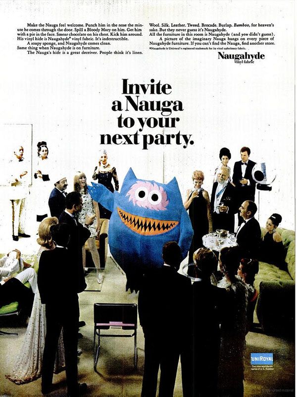
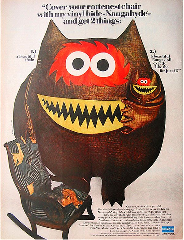
They took things to the next level when they offered a free Nauga doll with every Naugahyde reupholtering. These little Nauga dolls are totally collectible now, so if you see one…scoop it up! There are actually a few on eBay right now.
So remember that thrifting day when Greg came up to me clutching the Nauga? Well, I jokingly said to him, “Were there any more??” And he grinned and ran off….and came back with it’s identical twin. We thought it was hysterical (and hey, at 99 cents a piece how could we say no??).
I’m a big fan of the quirky spokesperson/ animals, so this guy makes me laugh! He’s a little bit ugly, a little bit kooky, a little bit spooky and a whole lotta playful! What do you think? Do you love this fella or does he freak you out?? haha. I guess the one thing he isn’t is cuddly!
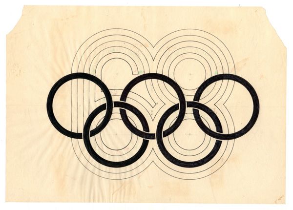

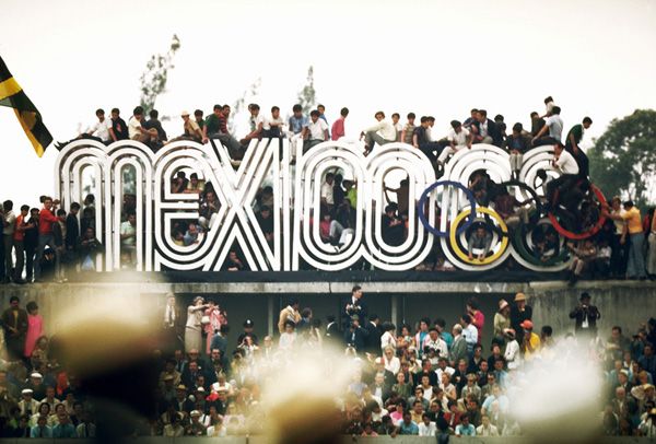
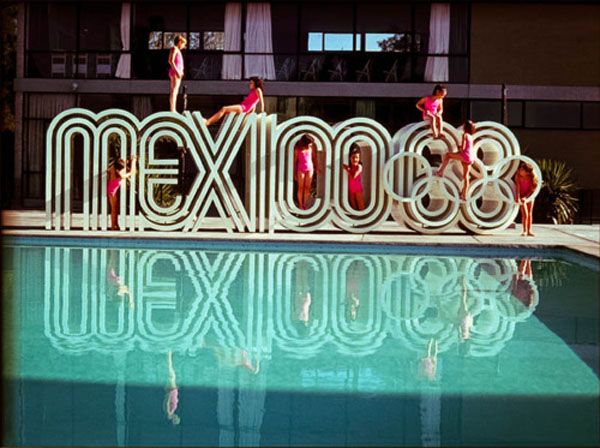
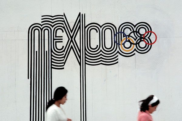
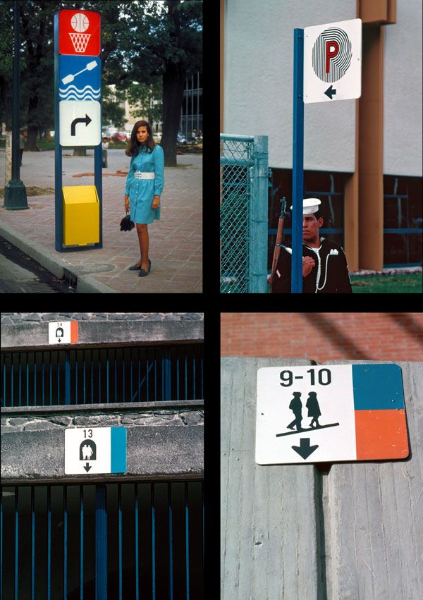
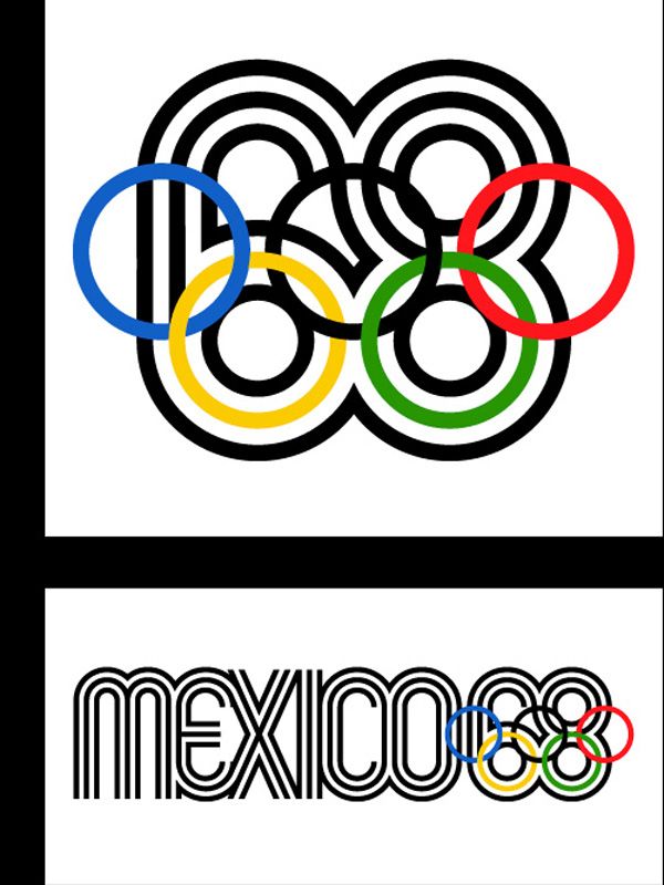
The year was 1968 and the Summer Olympics (or the Games of the XIX Olympiad, as they were officially called!) were held in Mexico City, Mexico. The Mexican Olympics were notable for many things: they were the first Games hosted by a Latin American nation, they were the first Games to feature a woman torch-bearer lighting the Olympic flame…they were the Olympics where more world records were broken than in any other prior Olympiad and they were the Olympics where two African-American athletes took a stand for human rights by infamously raising their black-gloved fists. But perhaps one of my favorite things about that Olympics? The innovative (and crazy excellent!) graphic design system created to celebrate these Games. The bar had been set high by Tokyo in 1964, and the Mexican Olympic committee wanted to make a similar splash.
Pedro Ramirez Vázquez, Chairman of the Organizing Committee and an important Mexican architect, took the lead on the design committee and eventually selected Lance Wyman as head graphic designer (USA) as well as Eduardo Terrazas (Mexico) as the lead on Urban Design.
Sketches and color explorations from inside Lance Wyman’s studio:
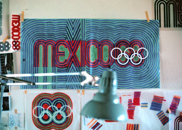
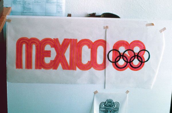
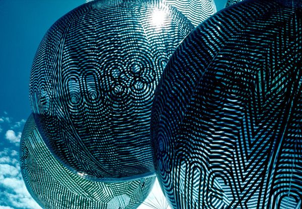
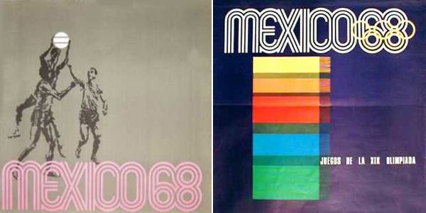
“As I recall there were only two mandatory requirements; that we use the official five ring Olympic symbol to identify the games, and that we use three languages—Spanish, English and French—for all written communication. The Mexico 1968 logotype, which was based on traditional forms from Mexican culture as well as being Sixties pp-art kinetic typography, set the tone for the entire graphics system. It was designed by integrating the official five ring Olympic symbol into the number “68” to create a parallel line typography that suggested imagery found in Mexican pre-Hispanic art and folk art. The logotype powerfully expressed a sense of place and culture and visually exclaimed the Games were in Mexico.”  —Lance Wyman
from The Olympic Image: The first 100 Years, Compiled & Edited by Wei Yew  © 1996
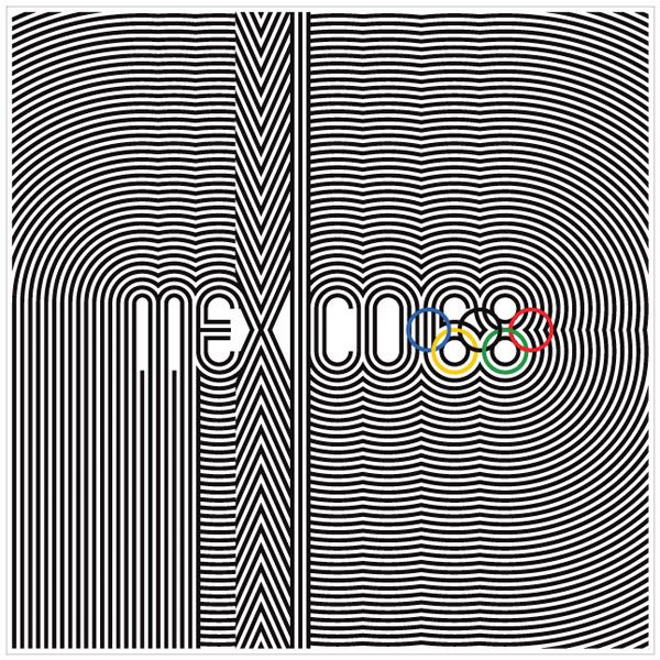
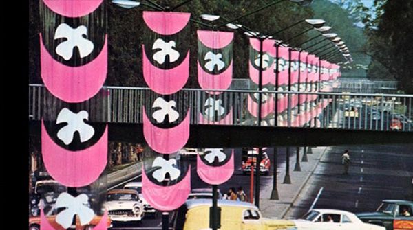
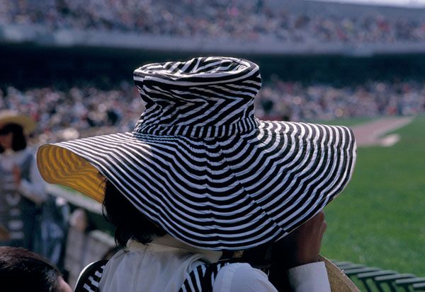
Ahhhhh! I just love everything about this look. That lettering is so terrific. And that hat?? Man. What a souvenir, eh? It’s so clever—combining traditional Mexican imagery with 1960s op-art. No wonder it’s so legendary!
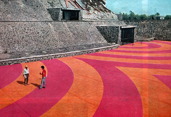
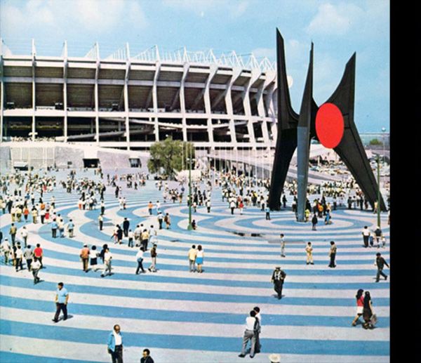
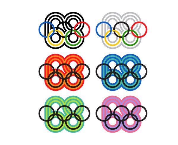
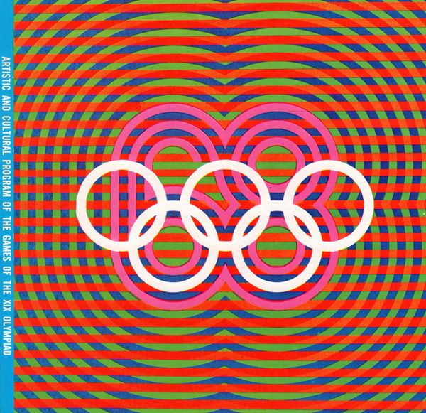
They also created a simple but bold icon system to help code all the various events. And then, of course, there was the color.
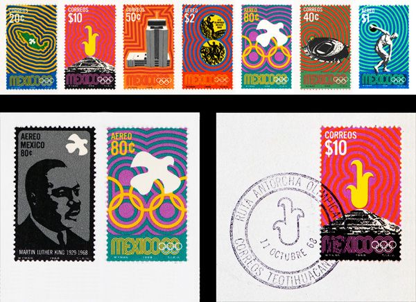
“Colour and Mexico are synonymous. We used bright colour to code the sport events, the motor routes, the entry tickets, and the seating sections in the venues. We applied colour liberally to postage stamps, publication mastheads, souvenirs, and stadium plazas. Colour helped transform the 1968 Summer Olympic Games into a Mexican fiesta!” —Lance Wyman
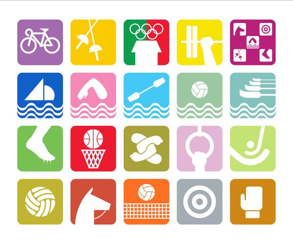
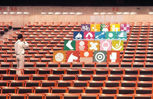
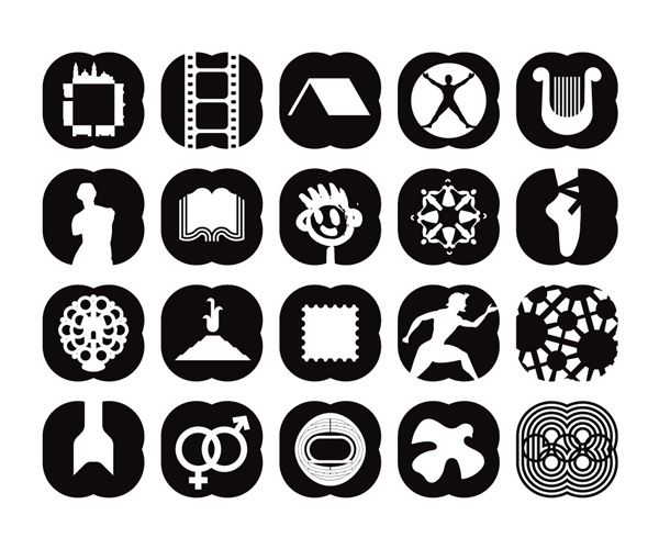
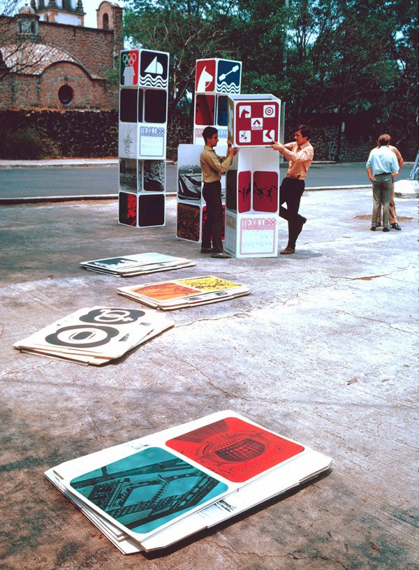
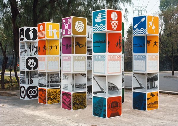
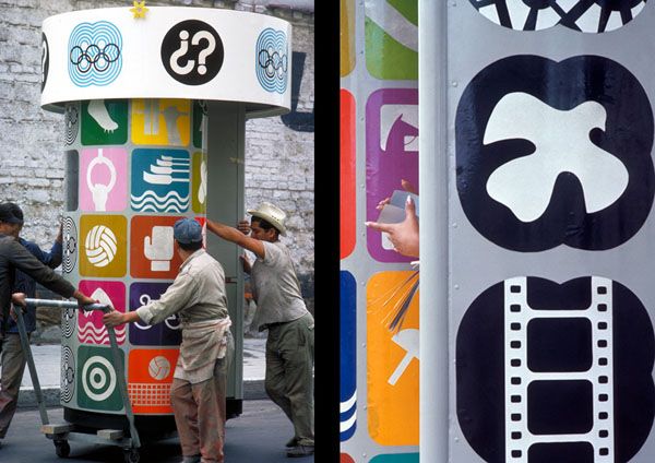
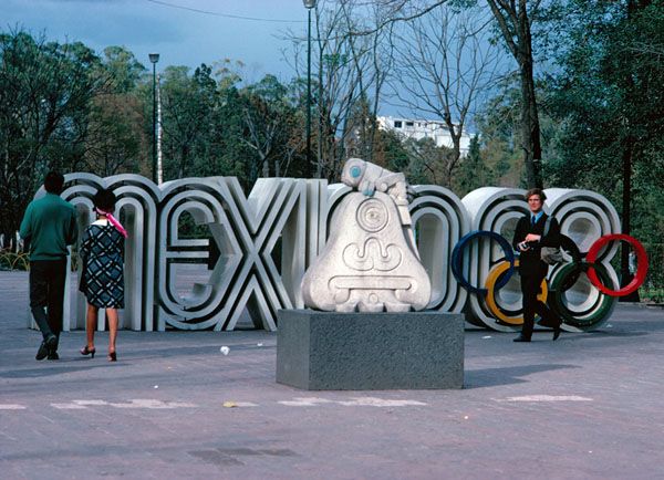
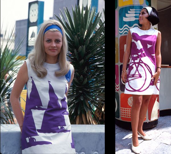
The amazing thing was how the logo and graphic system was integrated into every visual aspect of the ’68 Games, from tickets to events, to stamps, postcards, signs, programs, even clothing!
I just love it….it’s still as fresh and modern today as it was back then. What do you think?
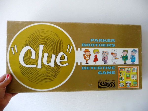
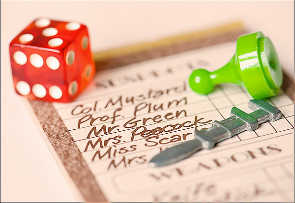
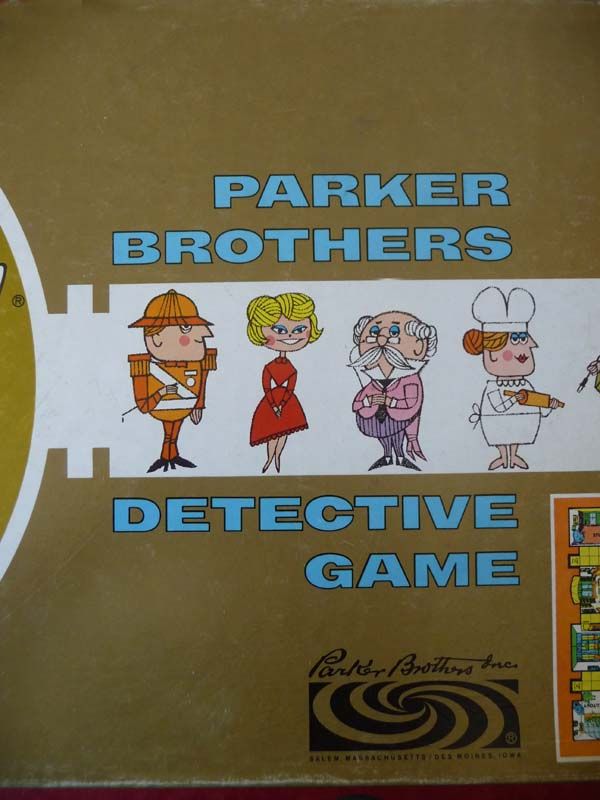
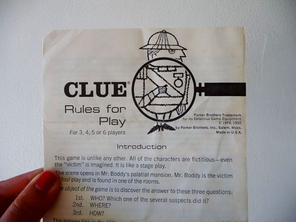
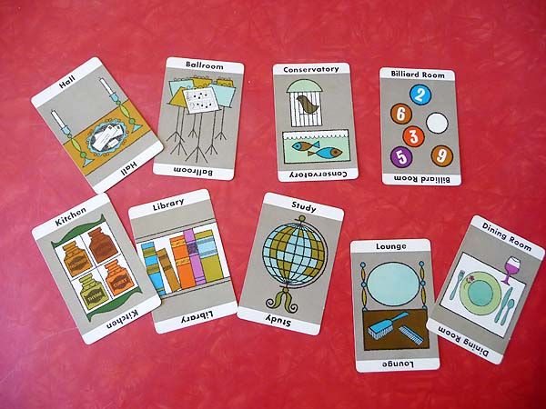
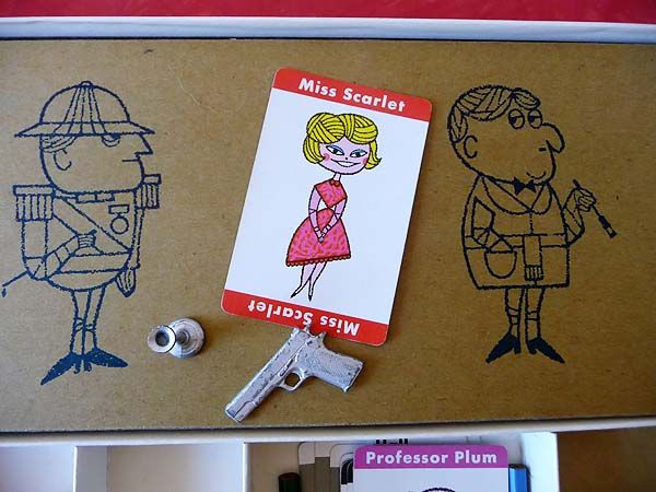
Meet my favorite board game. Clue. This charming lil “murder mystery” detective game is really one the whole family can get into. The premise? Someone has killed Mr. Boddy and you must deduce WHO DONE IT! Players get to choose from 6 different “characters” (aka suspects) and you travel around Mr. Boddy’s mansion, collecting clues. The ultimate goal is to figure out who was the murderer, in what room he (or she!) killed Mr. Boddy and with which weapon. Sounds grisly but I promise ya, it’s not at all! The feels a bit like an Agatha Christie Miss Marple mystery—and because it’s not scary, its great fun for kids. Over the years they’ve released several different versions of the Clue board game, with the graphics updating to reflect the design of the time.  We love it so00 much we have four different sets! You might recall we also took it camping with us.
Clue first got its start in 1944 in Birmingham, England when solicitorâ€s clerk Anthony E. Pratt filed a patent for a game called “Murder!†  It was eventually licensed to Waddingtons (in the UK ) and to Parker Brothers (in North America, where it was renamed it simply “Clueâ€). Prattâ€s original game was slightly different from the version finally released in 1949. Originally he had ten characters who would become suspects and eleven mansion rooms as possibilities for the scene of the crime—including a gun room and cellar. Most intriguingly he had nine murderous weapons, including such gems as the axe,  a syringe, poison and the mysterious shillelagh. (!!!!)
Let’s take a look at one is one of my favorite versions, the 1963 edition. Just look at the cute illustrations!
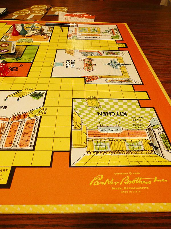
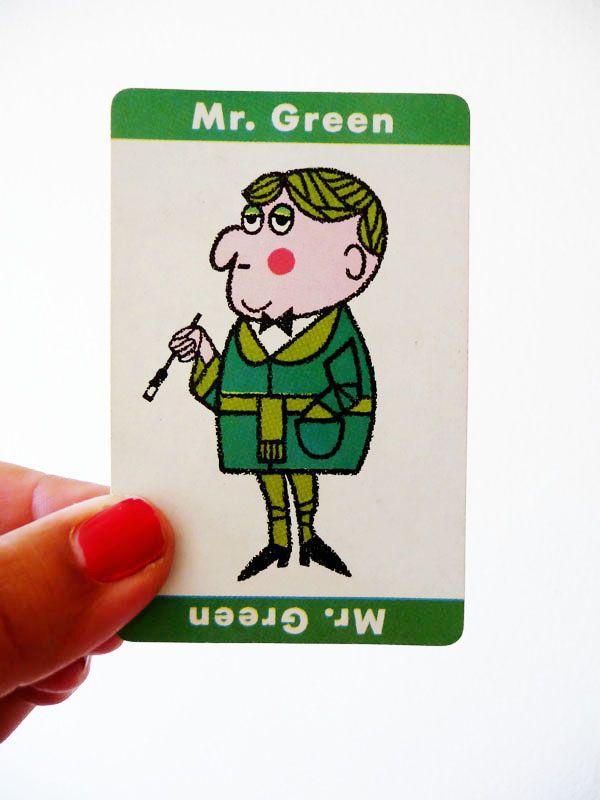
Cuuuuuuuuuuute, yes?? I bet Mr. Green did it. With the shillelagh. Hee.
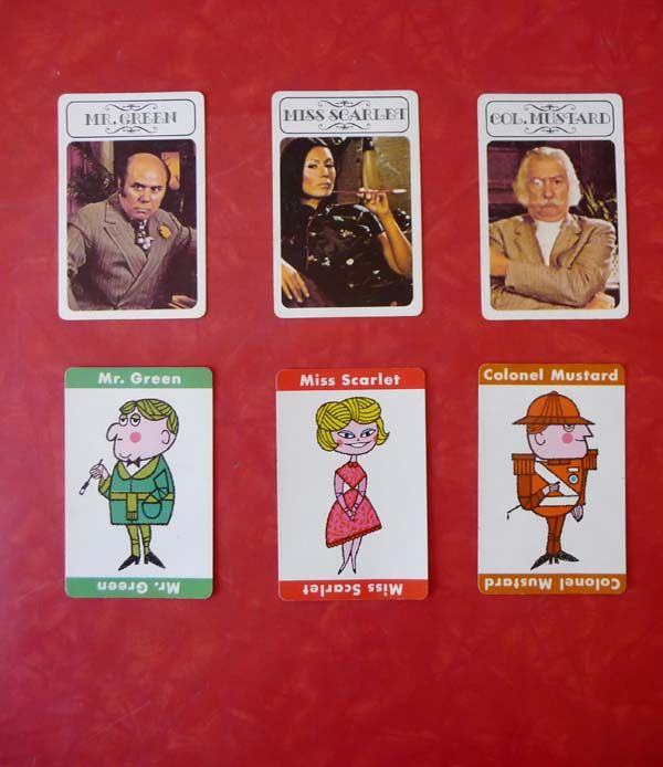
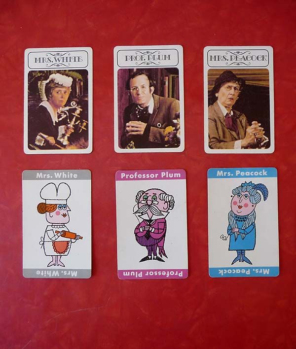
But as cute as this is, I have to confess my REAL favorite is the one I grew up with. That’s THIS 1972 version. And oh ho ho, is it different. You don’t get the same charmingly sweet drawings, but this version has the added layer of mystery and drama by showcasing actual actors as the characters. And oooh the drama!
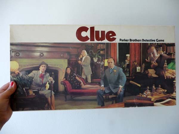
I mean, look at that mysterious spray of broken pearls! Â The cream colored princess phone that’s off the hook (literally and figuratively). Â Amazing! I love the design of this edition so much…
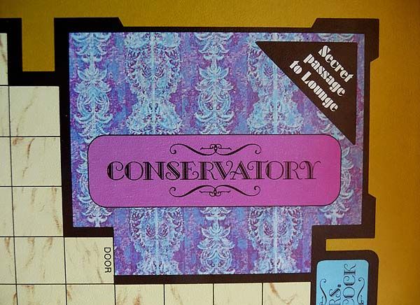
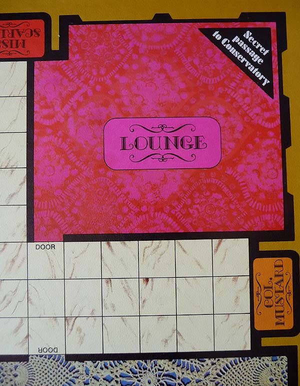
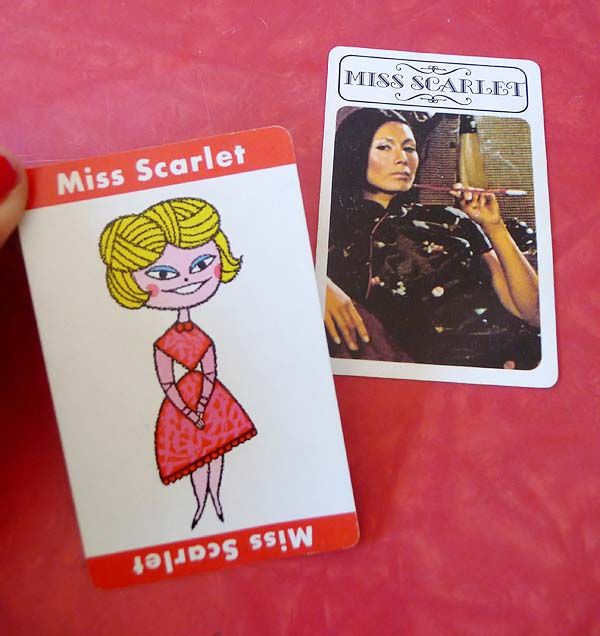
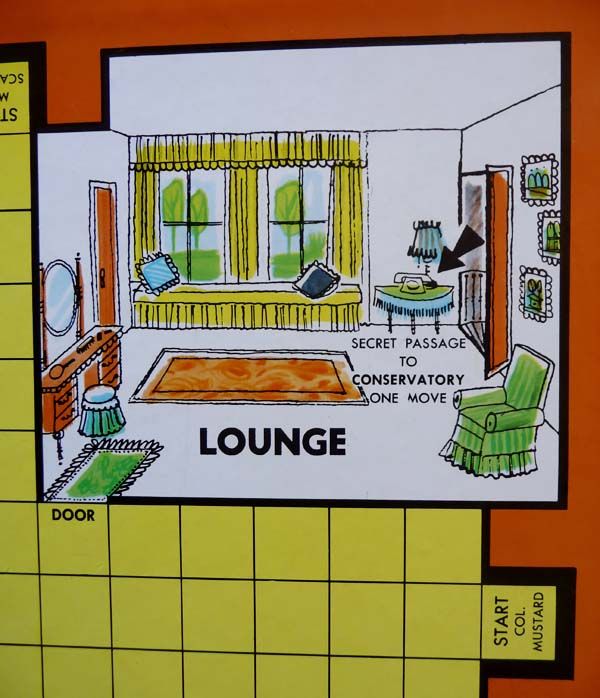
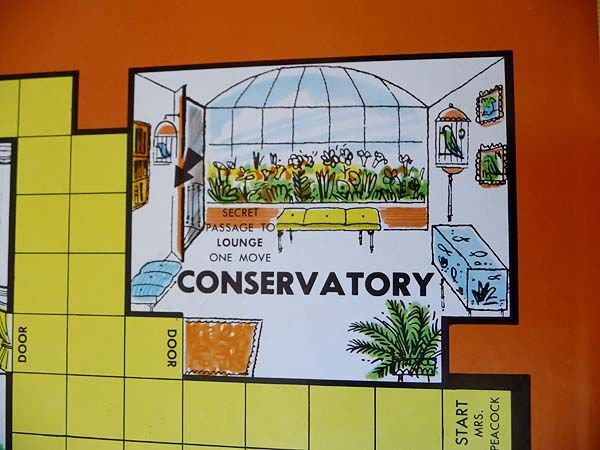
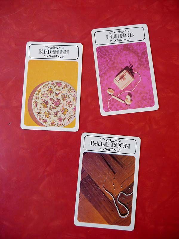
I was always Miss Scarlet….and I was verrrrry transfixed by The Lounge. And The Ballroom. And ze candlestick. We played this game alot growing up. I still can hear my favorite aunt, Tante Maria counting out her prediction in her cute German accent, “It vas Mista Green, in de conservatory….mit de leadpipe!” My Uncle Max was always sneaky and would try and spy on us to see which portion of the notepad we were marking off when we got our clues (top portion meant person, middle was weapons, bottom was rooms!).
I love to see how they have updated the game over the years. The latest versions I’m not too keen on, but just look at these two. SO MUCH FUN!
OK friends. Do you love Clue?? And did you know there was a CLUE movie? I haven’t seen it in years but I remember loving it. I wonder if it has stood the test of time….hmmm. Perhaps I will cozy up in the Lounge with my candlestick and a copy of it this weekend!
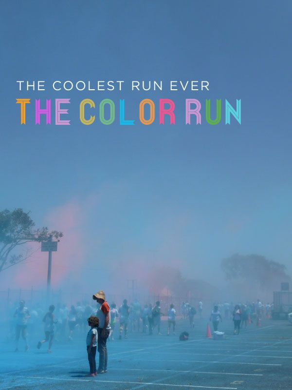
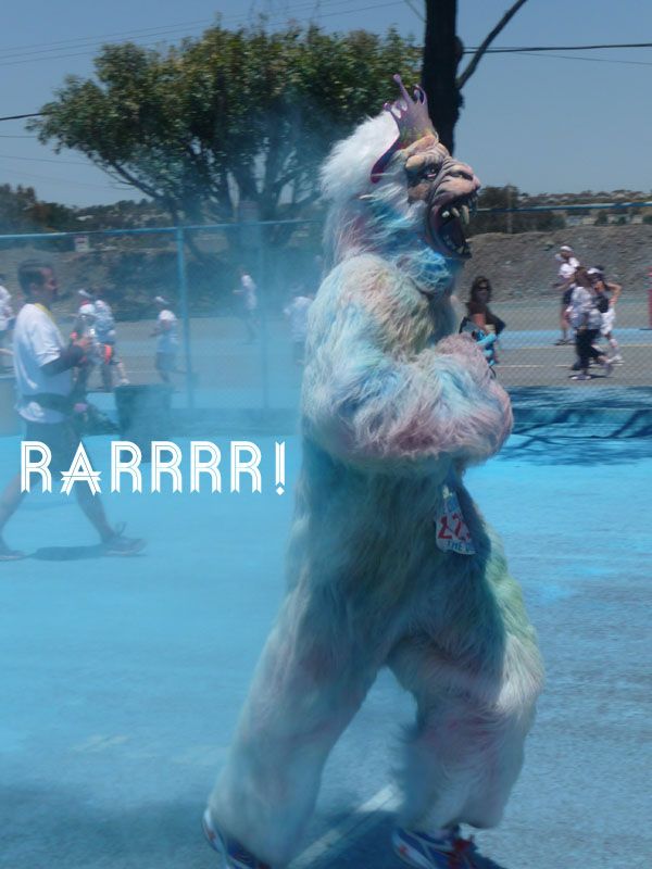
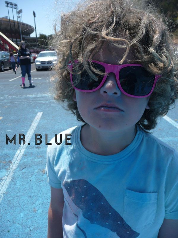
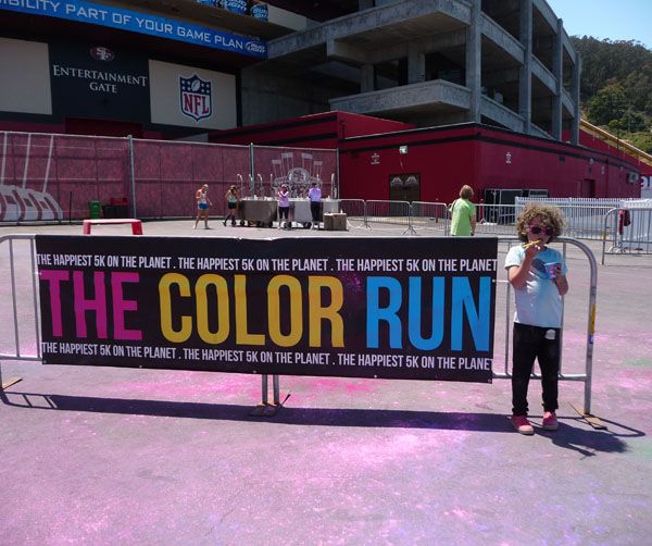
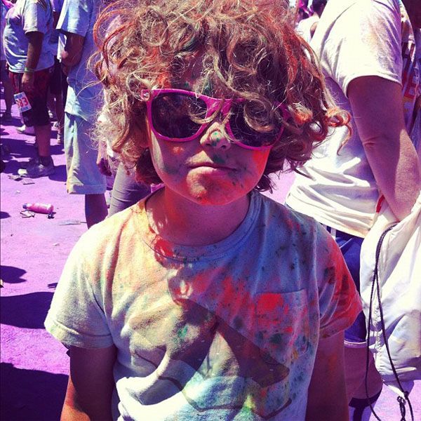
This weekend Wolfie, Greg and I participated in one of the coolest things ever: The Color Run!
The Color Run is a unique 5 kilometres event unlike any other. It’s a one-of-a-kind experience that is less about speed and more about enjoying a crazy colorful day with your friends and family. All levels of experience are welcome, all that matters is that you participate—and that you wear white clothing! Why? Because at every 5 kilometer marker, runners get blasted with colored powder, turning the procession into a moving rainbow. And friends, it’s AMAZING!!
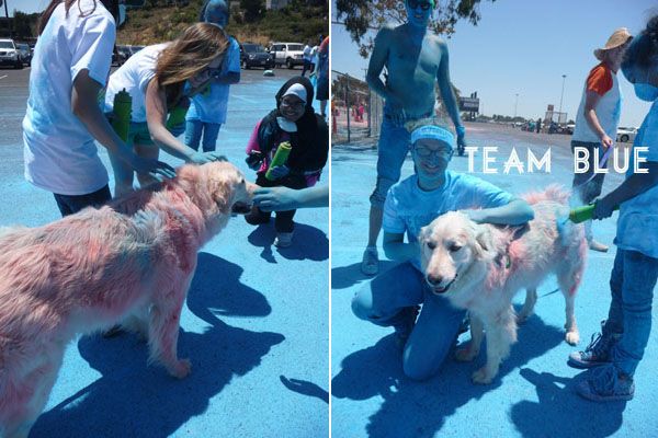
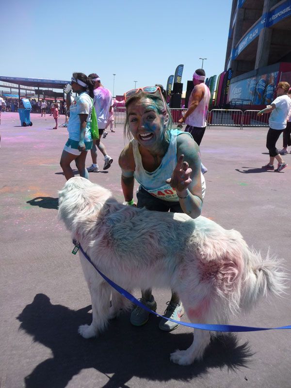
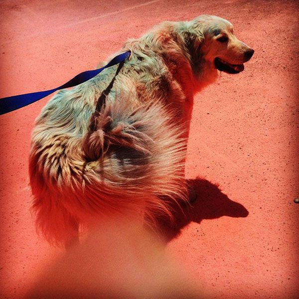
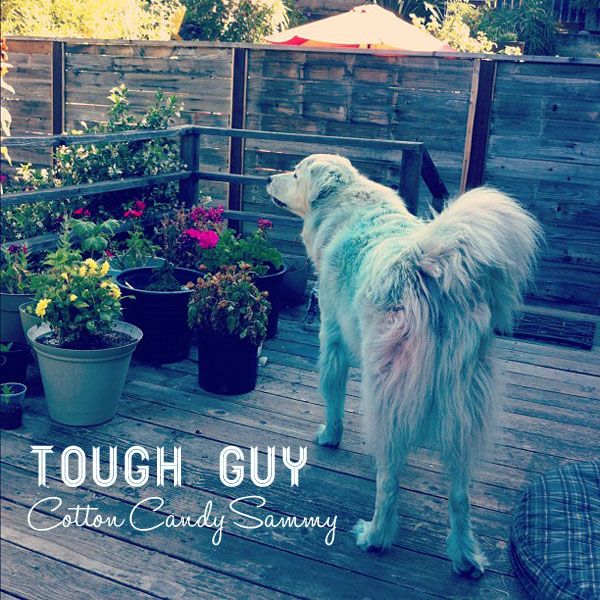
Soooooo, the run fills up really quickly and spots in the San Francisco run were all full. But that didn’t stop us! We decided we’d show up anyway to support the runners and check it all out. We weren’t sure if we could bring Sammy  (technically, I think dogs weren’t supposed to be there) BUT he’s such a big love, everyone just lit up when they saw him and ran over to pet him. With his big smile and wagging tail, he sort of became the unofficial “Happiness Mascot” of the SF Color Run!
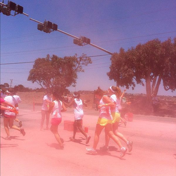
We started hanging out at the pinkie red kilometer color marker and as you can see, Sammy really got into the spirit of things!
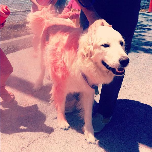
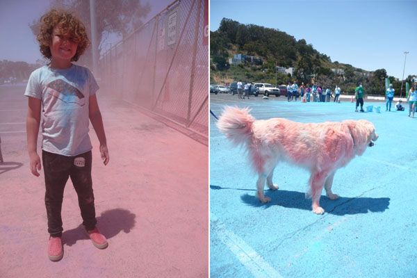
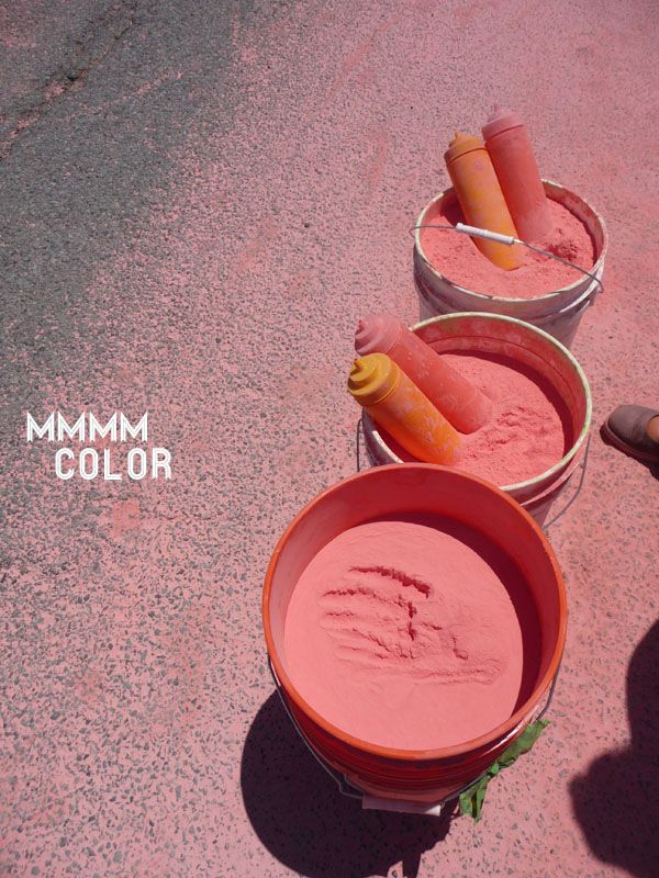
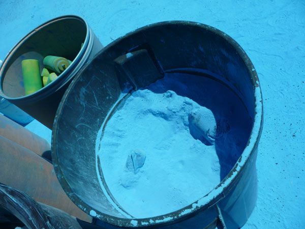
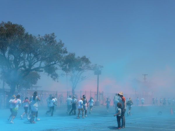
We decided to check out the blue team, and those guys were all was jealous that Sammy was all pink, so they got in on the action too—giving Sam a pretty baby blue bath. The powder, by the way, is an all natural non-toxic mix. It’s corn starch and color—and it’s safe to eat, although the warn you it’s highly caloric. Don’t taste the rainbow…

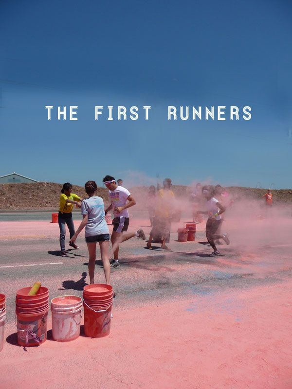
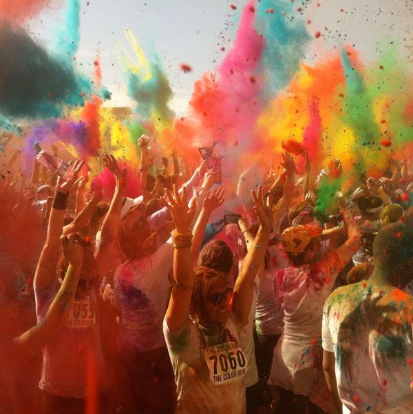
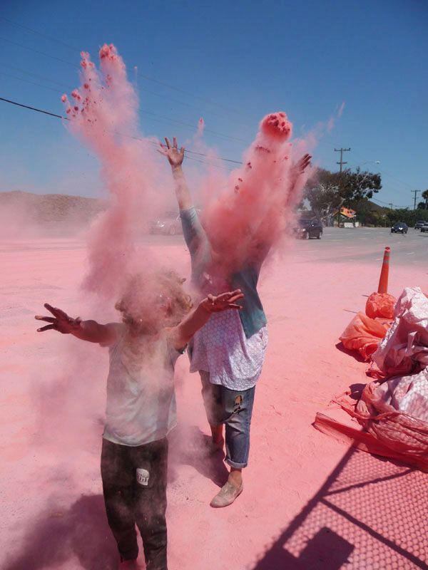
The race starts out slow….you see a handful of runners coming through, with a lil splash of color. And then suddenly you see a SEA of people and the color cloud gets bigger and bigger!
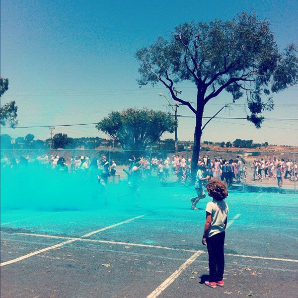

We didn’t make it over to the yellow station but it was SO great because we could see it in the distance and all you saw was this POOF of yellow. Even if you don’t run, you will still get lots (LOTS) of color splashes.
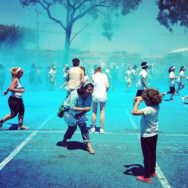
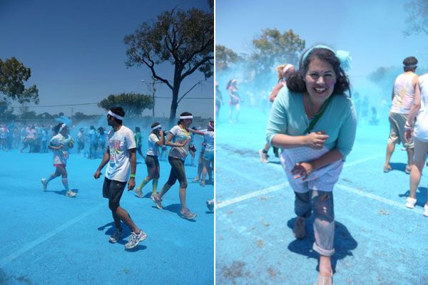
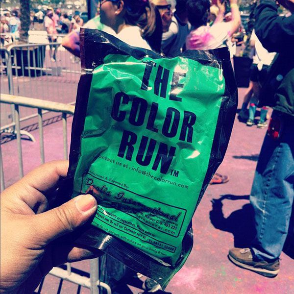
The finish line is one big colorful dance party…they toss out extra packs of color (and you can buy larger packs like that one up there) and people are just throwing color all over the place. Everyone is bouncing around and grinning. SO. MUCH. FUN! The whole scene looks like a futuristic, candy colored, post apocalyptic water color painting! Hmm, never thought I’d type THAT phrase!!

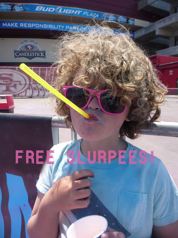
They gave away free Slurpees and Coconut Water too… Whoo hoo!

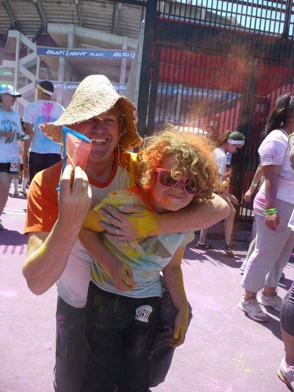
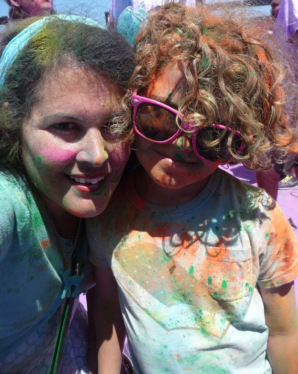
I can’t recommend this enough. And it’s a great thing to do with kids (whether they run or simply enjoy the color mania). They have Color Runs all across the country, through out the year. Even if you can’t run, you should head on down and check it out—in some ways its even more fun just volunteering and observing. There was so much happy energy in the place! Everyone was smiling {Special howdy do to our sweet pal Nuala from tea collection, who we ran into there!} Wolfie thought it was the coolest thing ever and wants to start training to run for next year!

PS
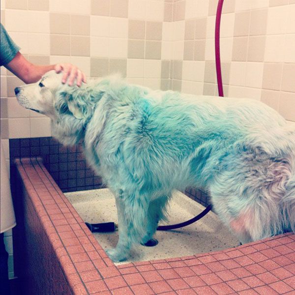
We were soooooo filthy when we got home, and it took a while for us all to get cleaned up. So we decided to wait to bathe Sammy til the next day. Um…mistake. The blue dye is reeeeally tricky to get out! He’s nearly white, but still has little blue paws and tail.
PPS
This is the video that Wolfie and I watched back in January, and it was what sold us on the event! I hope you watch it with your kiddos too!
]]>