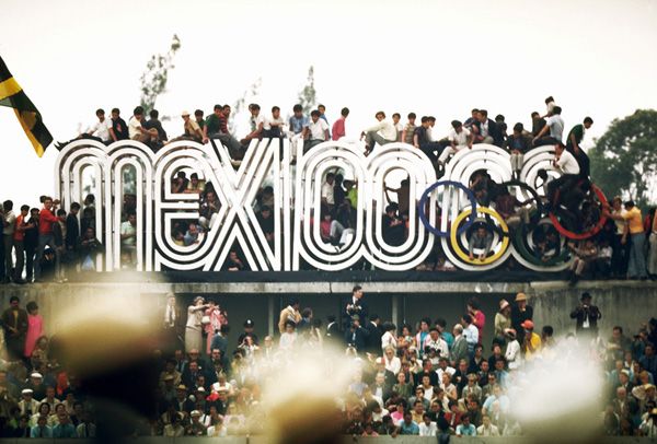
The year was 1968 and the Summer Olympics (or the Games of the XIX Olympiad, as they were officially called!) were held in Mexico City, Mexico. The Mexican Olympics were notable for many things: they were the first Games hosted by a Latin American nation, they were the first Games to feature a woman torch-bearer lighting the Olympic flame…they were the Olympics where more world records were broken than in any other prior Olympiad and they were the Olympics where two African-American athletes took a stand for human rights by infamously raising their black-gloved fists. But perhaps one of my favorite things about that Olympics? The innovative (and crazy excellent!) graphic design system created to celebrate these Games. The bar had been set high by Tokyo in 1964, and the Mexican Olympic committee wanted to make a similar splash.
Pedro Ramirez Vázquez, Chairman of the Organizing Committee and an important Mexican architect, took the lead on the design committee and eventually selected Lance Wyman as head graphic designer (USA) as well as Eduardo Terrazas (Mexico) as the lead on Urban Design.
Sketches and color explorations from inside Lance Wyman’s studio:
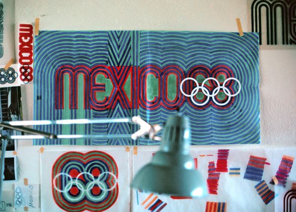
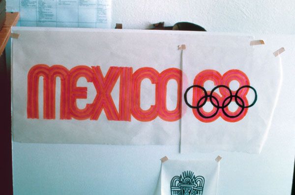
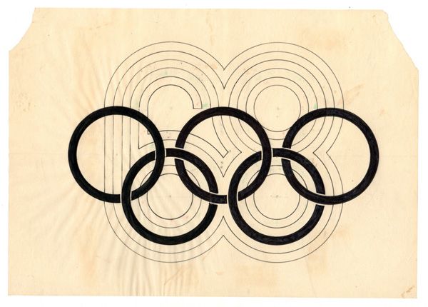
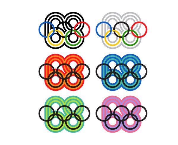
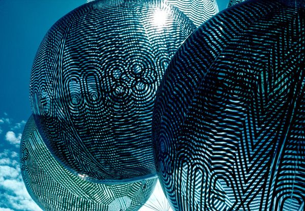
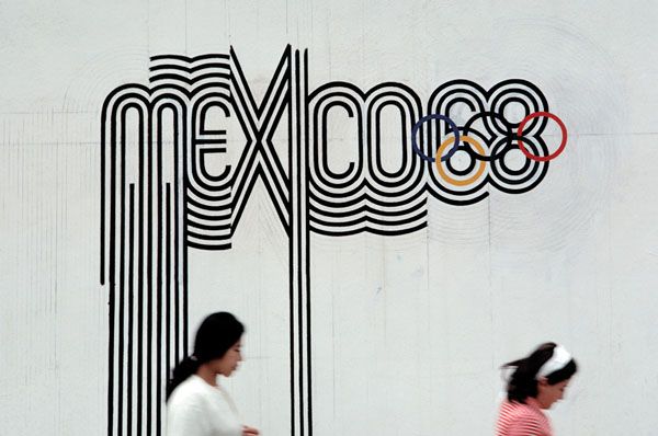
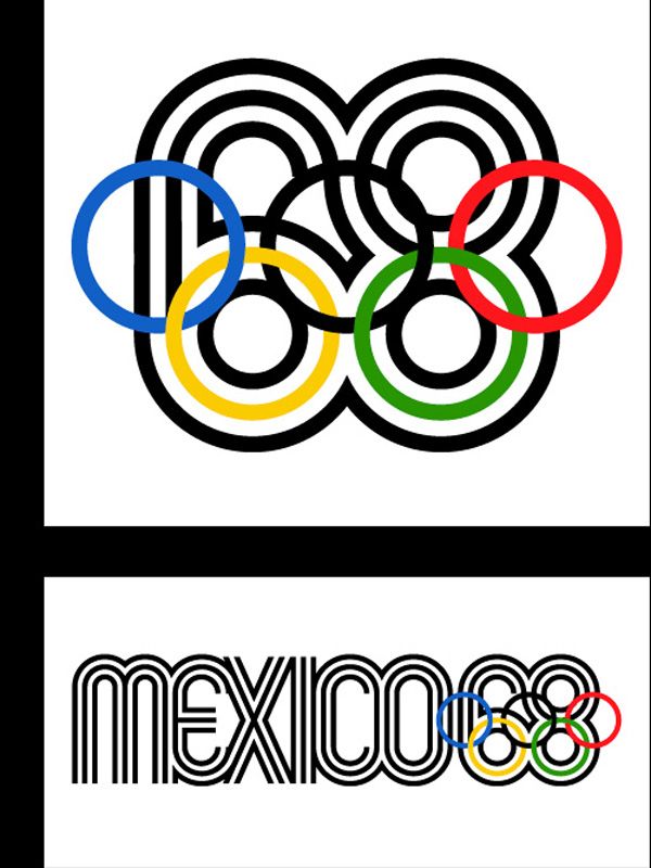
“As I recall there were only two mandatory requirements; that we use the official five ring Olympic symbol to identify the games, and that we use three languages—Spanish, English and French—for all written communication. The Mexico 1968 logotype, which was based on traditional forms from Mexican culture as well as being Sixties pp-art kinetic typography, set the tone for the entire graphics system. It was designed by integrating the official five ring Olympic symbol into the number “68” to create a parallel line typography that suggested imagery found in Mexican pre-Hispanic art and folk art. The logotype powerfully expressed a sense of place and culture and visually exclaimed the Games were in Mexico.”  —Lance Wyman
from The Olympic Image: The first 100 Years, Compiled & Edited by Wei Yew  © 1996
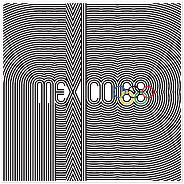
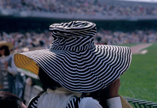
Ahhhhh! I just love everything about this look. That lettering is so terrific. And that hat?? Man. What a souvenir, eh? It’s so clever—combining traditional Mexican imagery with 1960s op-art. No wonder it’s so legendary!
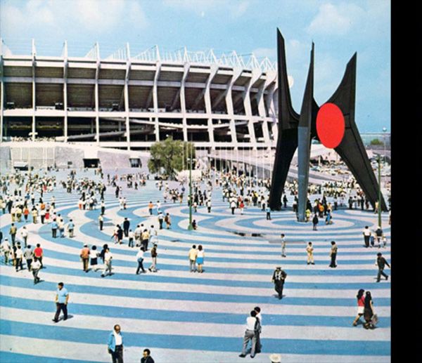
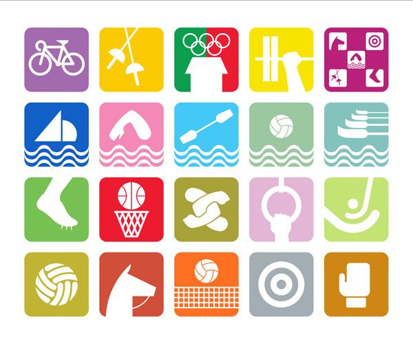
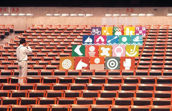
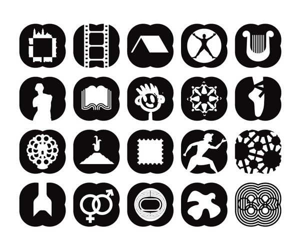
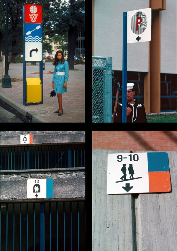
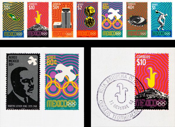
They also created a simple but bold icon system to help code all the various events. And then, of course, there was the color.
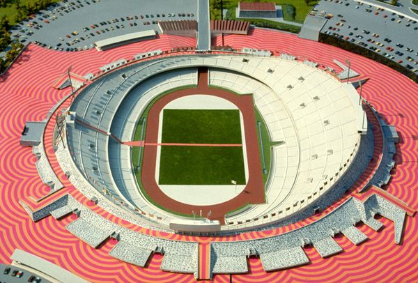
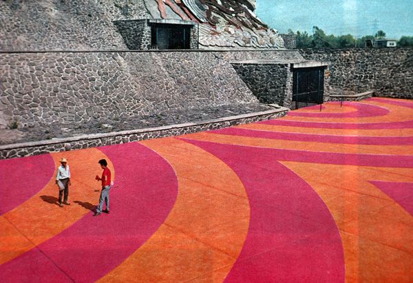
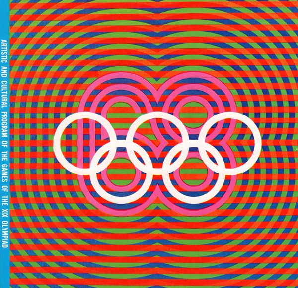
“Colour and Mexico are synonymous. We used bright colour to code the sport events, the motor routes, the entry tickets, and the seating sections in the venues. We applied colour liberally to postage stamps, publication mastheads, souvenirs, and stadium plazas. Colour helped transform the 1968 Summer Olympic Games into a Mexican fiesta!” —Lance Wyman
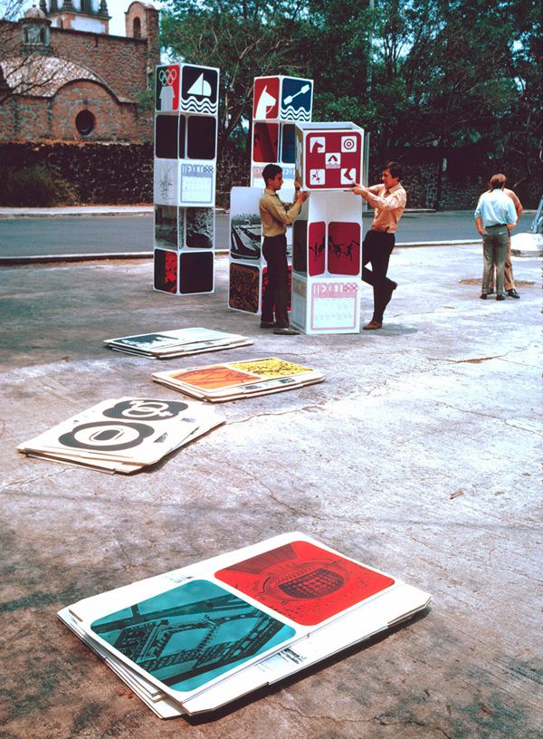
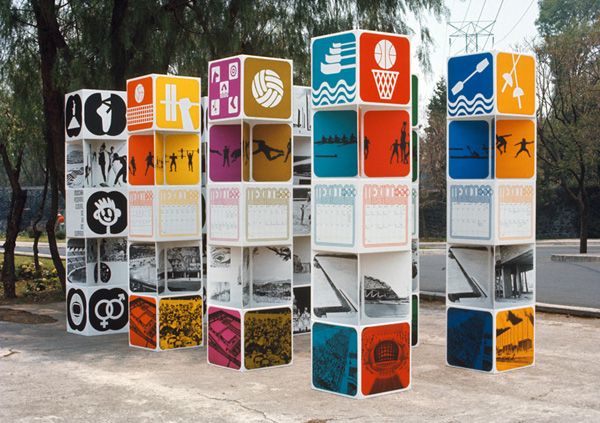
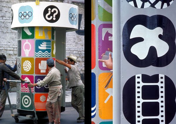
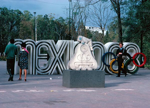
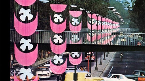
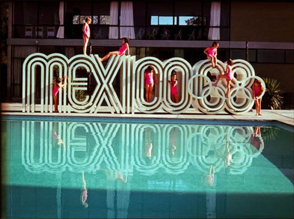
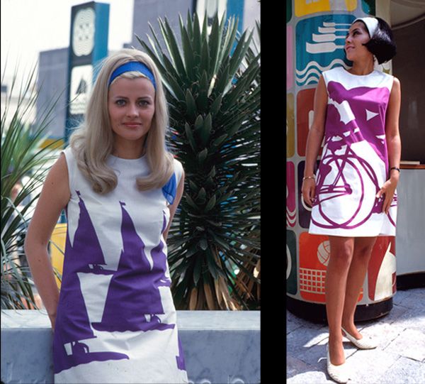
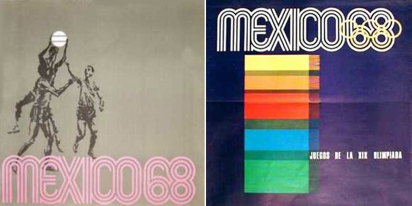
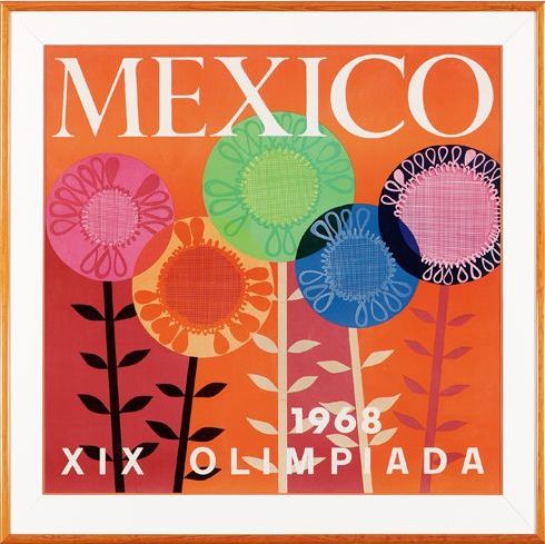
The amazing thing was how the logo and graphic system was integrated into every visual aspect of the ’68 Games, from tickets to events, to stamps, postcards, signs, programs, even clothing!
I just love it….it’s still as fresh and modern today as it was back then. What do you think?

This was fantastic!! Simplly stunning, to recall and remember the Olympics during the year 1968! A personal important year for me!!
Viva Mexico!
Love it!! That was the year I was born! Thanks for the reminder of how timeless art and fashion really are!
xo
Jill
Alix–wow. Just WOW! Completely beautiful and beats the tar off of all of the other Olympics. Especially the London logo which I think is so ghastly, personally!
LOVE it all!! The font, style, graphics, sigh! Fabulous pics thanks for sharing! Look at how colorful all the cars in the parking lot are in that 3rd pic. Car colors now are so neutral!
Love this post, dolls!
OK–one more comment–I would totally wear those cool a-line dresses instead of those really weird ones they wore in the opening ceremonies that had pictures of all of the volunteers on them. I thought they were totally freaky!
Holy Mole! I’ve never seen those pics and they are all kind-of crazy shades of wonderful. And those dresses and the pool scene. Ahhhh.. We need another Olympics like that. 🙂
I couldn’t agree more!
what a cool post! one of my favorites!
Same here! It is one of those perfect posts that Alix just pulls out. Totally amazing and exactly what Modern Kiddo is about! Thank you again, Alix, for this great post!
Coxoxo
Incredible display of 60s design. I love it.