Category Archives: Vintage Graphics

VINTAGE OLYMPICS // Mexico 1968

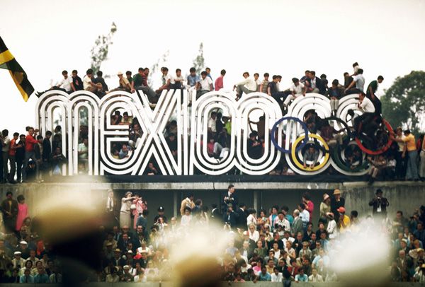
The year was 1968 and the Summer Olympics (or the Games of the XIX Olympiad, as they were officially called!) were held in Mexico City, Mexico. The Mexican Olympics were notable for many things: they were the first Games hosted by a Latin American nation, they were the first Games to feature a woman torch-bearer lighting the Olympic flame…they were the Olympics where more world records were broken than in any other prior Olympiad and they were the Olympics where two African-American athletes took a stand for human rights by infamously raising their black-gloved fists.

But perhaps one of my favorite things about that Olympics? The innovative (and crazy excellent) graphic design system created to celebrate these Games. The bar had been set high by Tokyo in 1964, and the Mexican Olympic committee wanted to make a similar splash! Take a look at this:

Pedro Ramirez Vázquez, Chairman of the Organizing Committee and an important Mexican architect, took the lead on the design committee and eventually selected Lance Wyman as head graphic designer (USA) as well as Eduardo Terrazas (Mexico) as the lead on Urban Design.

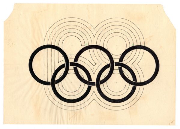
Sketches and color explorations from inside Lance Wyman’s studio:

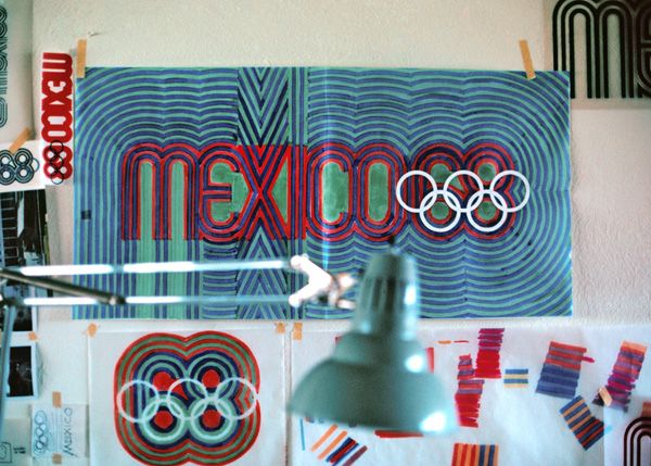
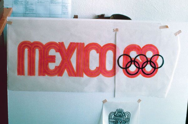
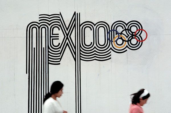
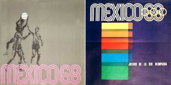
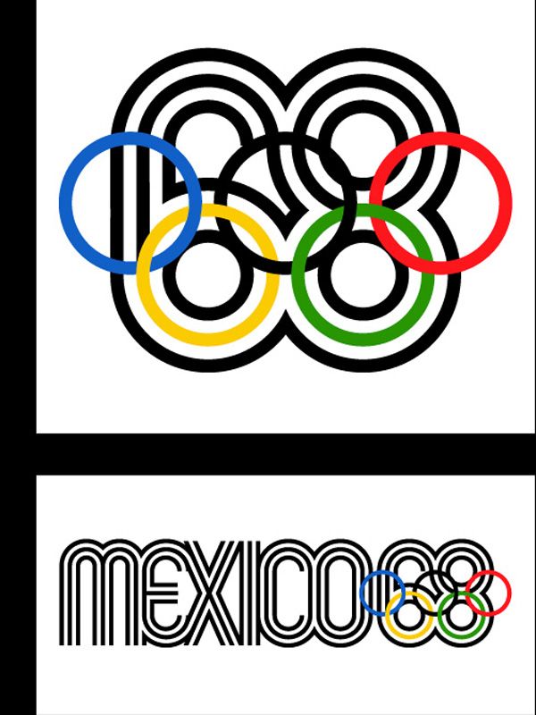
“As I recall there were only two mandatory requirements; that we use the official five ring Olympic symbol to identify the games, and that we use three languages—Spanish, English and French—for all written communication. The Mexico 1968 logotype, which was based on traditional forms from Mexican culture as well as being Sixties pp-art kinetic typography, set the tone for the entire graphics system. It was designed by integrating the official five ring Olympic symbol into the number “68” to create a parallel line typography that suggested imagery found in Mexican pre-Hispanic art and folk art. The logotype powerfully expressed a sense of place and culture and visually exclaimed the Games were in Mexico.”  — Lance Wyman from The Olympic Image: The first 100 Years, Compiled & Edited by Wei Yew  © 1996

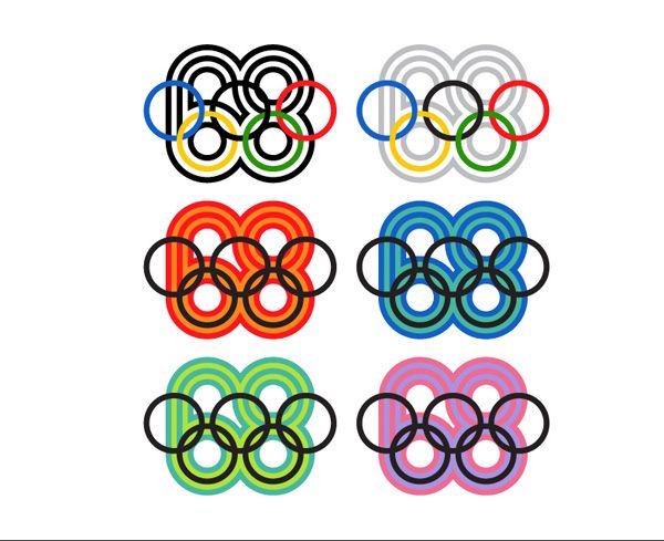
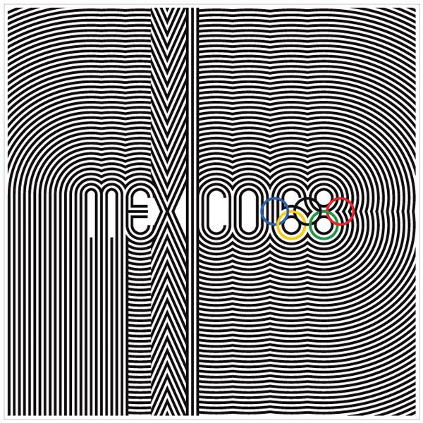
I just love everything about this look. That lettering is terrific and it’s so clever—combining traditional Mexican imagery with 1960s op-art. No wonder these graphics are so legendary.

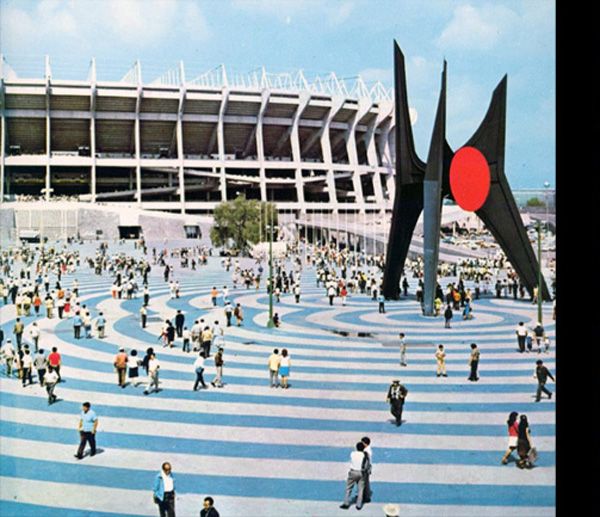
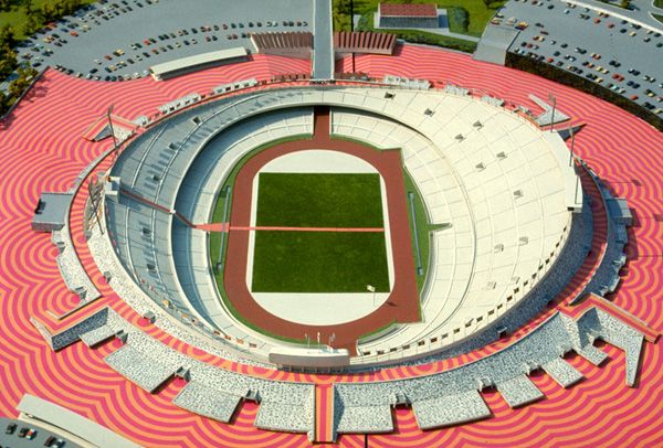
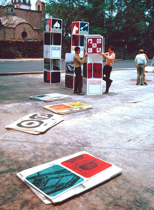
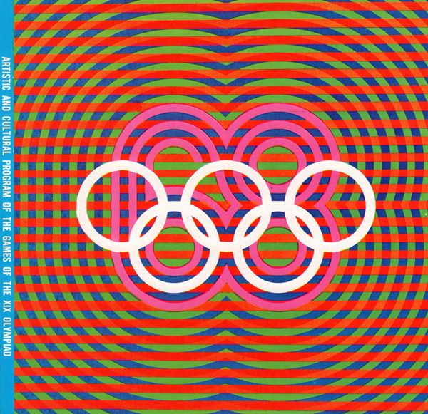
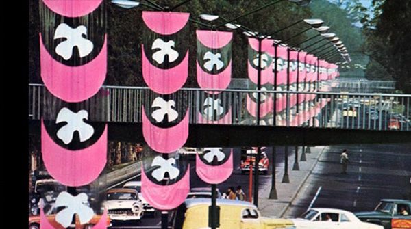
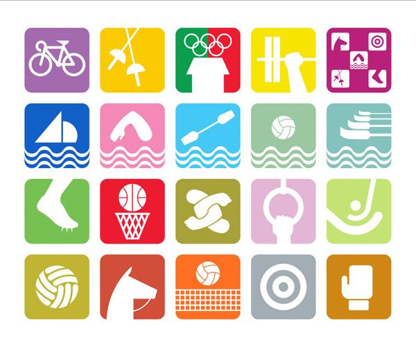
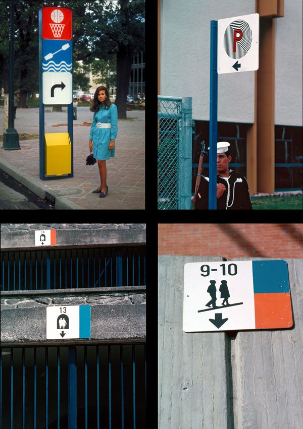
The designers also created a simple but bold and colorful icon system to help code all the various events.

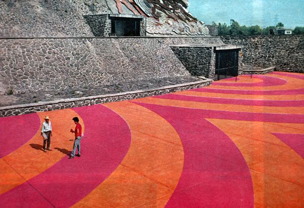
“Colour and Mexico are synonymous. We used bright colour to code the sport events, the motor routes, the entry tickets, and the seating sections in the venues. We applied colour liberally to postage stamps, publication mastheads, souvenirs, and stadium plazas. Colour helped transform the 1968 Summer Olympic Games into a Mexican fiesta!” —Lance Wyman

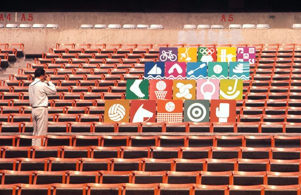
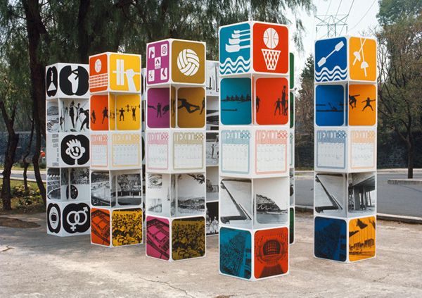
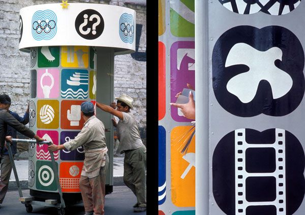
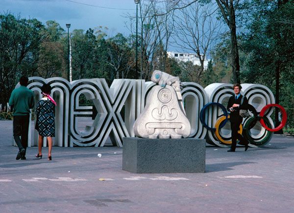
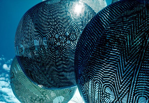
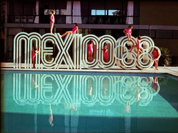
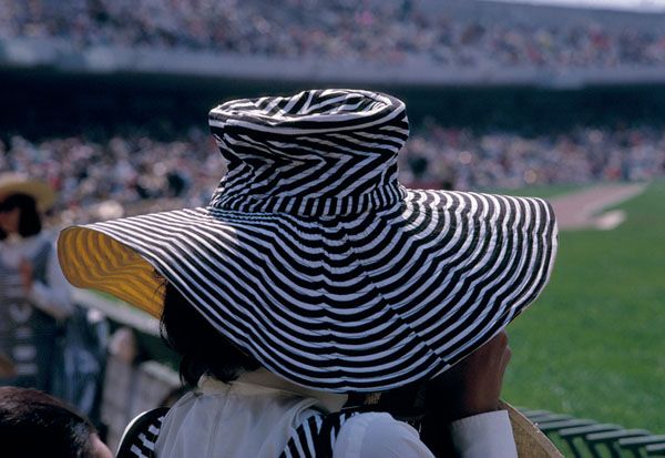
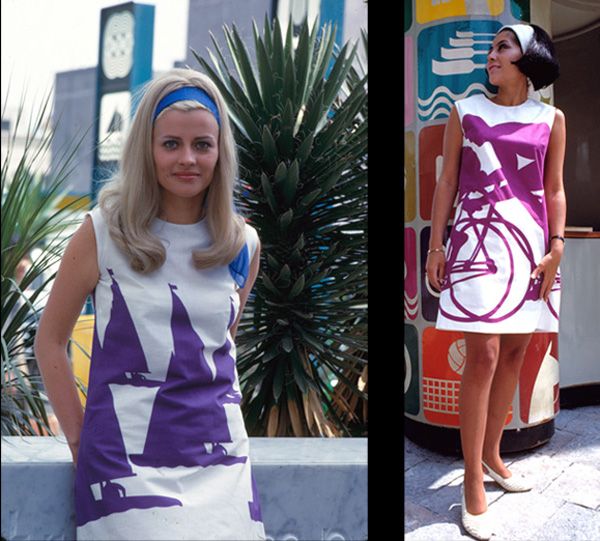
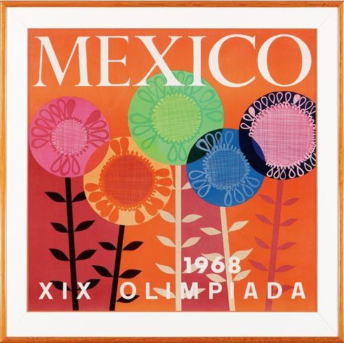
The amazing thing was how the logo and graphic system were integrated into every visual aspect of the ’68 Games, from tickets to events, to stamps, postcards, signs, programs, even clothing!


I just love it….it’s still as fresh and modern today as it was back then, don’t you agree?

I have to say I love the Olympics and I’m SO excited for the Sochi Games coming up next month. Last time the Winter Olympics rolled around, Wolfie and I were loving watching Shawn White and the snowboarders, Apollo Ohno and the speedskaters….and of course, my childhood favorite, the figure skating competition! Which events are you looking forward to most??

Flashback // The Colorful World of Alexander Girard.

Graphic, bold, playful, fun….we are big fans of Alexander Girard over here! His work has a childlike simpleness but is also rather sophisticated. I thought it would be fun to take a look at some of his awesomeness—and how he has really inspired so many of the looks we are all loving today!

Alexander (“Sandro”) Girard was born in New York City in 1907 and was an influential figure in post-war American design. Girard was head of textile division at the renowned Herman Miller furniture company and worked closely with his dear friends Charles & Ray Eames and George Nelson. (Now *there’s* a dinner party I’d love to be invited to!)

Alexander Girard’s playful patterns and bright colors were a breath of fresh air into the otherwise stodgy and often colorless domestic world of post-war America. Drawing inspiration from folk art — Girard’s personal collection reached some 100,000 items — he brought a dimension of taste and color to his work with Herman Miller and their other design leaders, George Nelson and Charles Eames. Today, Girard’s fabric designs are timeless expressions of charm, wit, and originality.

(from Herman Miller.com)

An avid world traveler, Girard’s designs always reflected his love of festive colours and patterns and influences from around the globe. You might remember this post I did a while back on airlines of the 1960s. Alexander Girard was responsible for revamping Braniff Airlines, launching an amazing campaign called the “End of the Plain Plane.”

He redid their entire identity…from airport lounges and plane interiors (orange and pink seats, anyone?) and even painted all the jets in bright candy colors. He also infamously hired Emilio Pucci to redesign all the flight attendants uniforms!

Yep. This was a man who had a fine appreciation for color! Sadly he passed away in 1993, but his legacy and passion lives on! There have been many awesome re-releases of his artwork. Here’s how you can add a little Alexander Girard into you (and your kiddo’s!) life.

MEMORY GAME + BLOCKS

The always awesome House Industries has partnered with the Girard Estate and released some amazing pieces featuring Alexander Girard’s artwork. The memory game is one of my favorites! He originally created the colorful images as environmental “enrichment panels” that were designed to spice up the Herman Miller offices. Each game comes with 72 pieces and a limited-edition wooden box. Buy one here. The building blocks are also colorful and fun (and printed with non-toxic, kiddo-safe inks). AND then a little something for mama…..they also have an amazing collection of Gerard-inspired fonts. Me want!

THE CUTEST GROWTH CHART.

Pincushion has taken some of his most iconic designs and put them on five fantastic growth charts! These are so great and would look pretty fab in any wall on your house. {yyou can order one here.)

SIMPLY AWESOME TRAY.

The Vitra Museum has released some of his artwork on these super snazzy serving trays. Score this sweet Alexander Girard Mother + Child Serving Tray here.

ADORABLE BOARD BOOK….ABOUT COLOR!


image: alison moore

This adorable chunky board book celebrates the vivid, playful, and sophisticated world of Alexander Girard (the cover features the vintage 1972 illustration “Girls” and there are 26 other classic Girard designs inside). Get a copy of Alexander Girard Color, here.

So there you have it. His work just makes me smile! And has me dreaming of a more colorful and fun airport….


The Eyes Have It.

 photo keane1.jpeg

I’m obsessed with Margaret Keane. When most people hear the name “Keane” they think of the somewhat cheesy big-eyed orphan paintings. What most people don’t know is that Margaret Keane’s early work in the 1960s is very different. She painted some of the most deliciously languid mod portraits around. True, the big dreamy eyes were still there….but these paintings are decidedly more grown up. I have a few prints of hers and an amazing book with excellent photo plates. I thought it would be fun to take a look!

 photo Keane_Mags.jpg

 photo keane2.jpeg

See what I mean? Still a tad creepy, but in a beautifully dreamy way…I love these petulant girls sipping their coffee:

Ahhh, the old portrait within a portrait. Creepily awesome.

While we are on the topic of the “classic Keane” look, allow me to dazzle you with a little of the history behind the Legend of Keane. It’s a good story. Back in the 60s, Walter Keane was known as the Master of the Big Eyed Waifs. While Margaret did these more chic ladies, his images were largely of young children with hauntingly sad eyes. The Keanes opened up a gallery in 1959 in New York and it quickly became a success. Walter was the consummate business man and the story goes that he would often leave faux packing cases addressed to famous movie stars so people would walk in and say, “Oooh, Dean Martin is buying one? I better get one before the prices go up!” Crafty, eh?

Throughout the ’60s, the popularity of Keane paintings soared. Stars like Joan Crawford, Natalie Wood, Dean Martin, Dinah Shore, Liberace and even Zsa Zsa Gabor all owned original Keane paintings. My favorite is this crazy portrait of Jerry Lewis and his family. And their pets. All with longing eyes. Totally insane:

In the ’70s LIFE magazine declared Keane’s paintings to be the most popular art in the western world. They even got a nod in the Woody Allen movie, “Sleeper” (Diane Keaton, presented with a big-eye painting, squeals with delight, “It’s Keane, it’s pure Keane!”).

In 1965, Margaret and Walter went through a bitter divorce—and it was revealed that Margaret was ACTUALLY THE ONE PAINTING ALL THE PAINTINGS! Walter simply took credit for them. It was never clear whether it was because they thought a male artist would have more credibility or if it was because he was a savvy, controlling business man. Either way, Walter was now attempting to stop her from painting “big eyed waifs” claiming he was the one who originated the style. They battled in court for years and finally the case made it to a federal court. The judge requested a “Paint Off” —asking that they each paint right then and there in the court room. Margaret triumphantly dashed off a quick portrait of a saucer-eyed child looking over a fence….while Walter, in a TOTAL Brady Bunch style maneuver, claimed he couldn’t paint because of a neck/shoulder injury. HAH! Needless to say, Margaret won. Bravo Margaret!

I have to confess I’m not much into any of her post Walter stuff. She said that while she was “living a lie” and letting him take credit, all her paintings had “sad eyes”. Her later work (in the 80s and 90s) has “bright eyes” as a result of her new-found happiness. (Is it wrong that I’m not a fan of her “new-found happiness??”) ANYWAY….let’s get back to her sad eyes, shall we?


image: the lovely whoreange

To date, Margaret Keane’s work has been discovered by a new generation and claims fans like John Waters, Tim Burton, Matthew Sweet and David LaChappelle. As I said in last week’s Link Hootenanny, Tim Burton is  directing the biopic on her life starring Amy Adams and Ryan Reynolds. I’m looking forward to that one!
The popularity of Margaret’s big-eyed babes inspired a slew of copycats…but I think we’ll save that for a follow up post, yes? So whatcha think friends….are these paintings terrific or terrifying? As Margaret herself has said, “You either love them or hate them….there really is no in-between.”

Chairman of the Board // Rich Uncle

 photo BoardGame1copy_zpsc6edcd87.jpg

I love vintage boardgames. They’re lots of fun to play but they also have excellent graphics. Often I find games that are simply older versions of current games—CLUE, Battleship, and Go to the Head of the Class. But I love it when I stumble upon a game I’ve never heard of before. Like RICH UNCLE!

 photo groovygame_5_zpsb6c4a23f.jpg

 photo groovygame_1_zpsce181eca.jpg

This quirky game board stands vertically by attaching to the side of the open box, and has 36 different spaces that correspond with the possible dice results. Oh and apparently the “Rich Uncle” is Uncle Pennybags, the portly, top hat wearing fella from Monopoly! Who knew?? He looks a bit different here because this is the 1965 edition of the game.

 photo groovygame_6_zps79233e87.jpg

 photo groovygame_2_zps7b8bbc4e.jpg

 photo groovygame_3_zps0d6ac788.jpg

 photo groovygame_7_zpsa7b3fe4a.jpg

THANKS Uncle PENNYBAGS!

 photo groovygame_4_zps1c0ff814.jpg

What are some of your favorite board games to play? We’re partial to Clue, Trouble, Monopoly (Wolfie got Monopoly Millionaire for Christmas…I’m a fan of Monopoly Jr., which has a shorter game time than the original—which can last FOREVERRRRRR).