Category Archives: Vintage Pop Culture

lunch box love

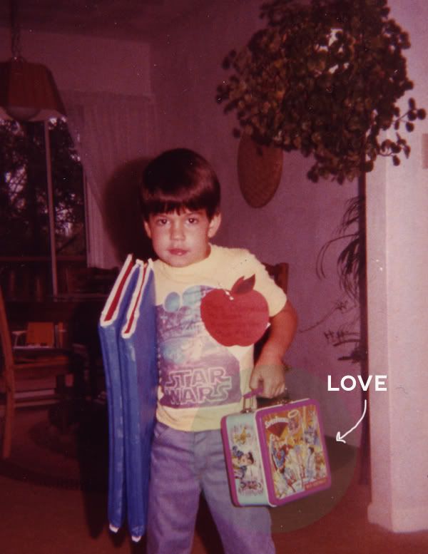
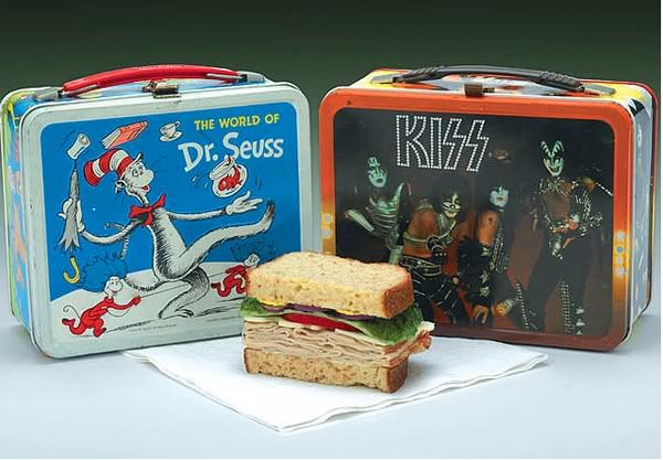
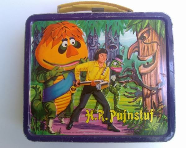
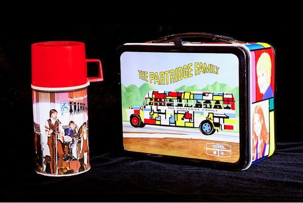
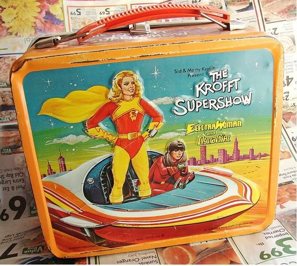
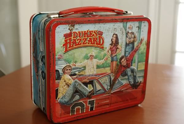
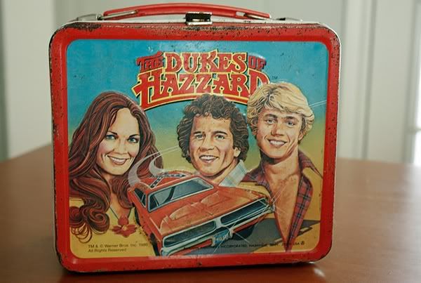
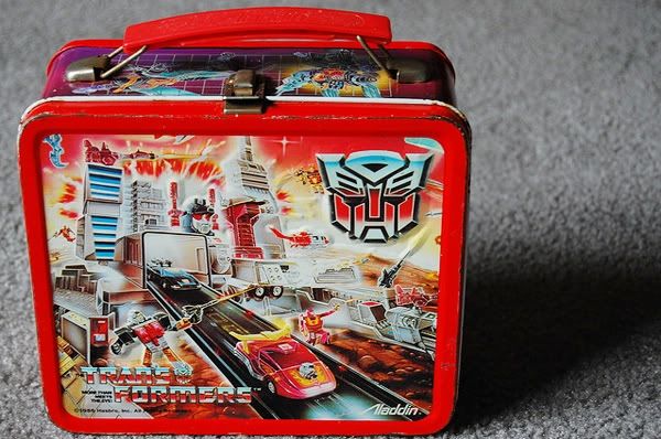
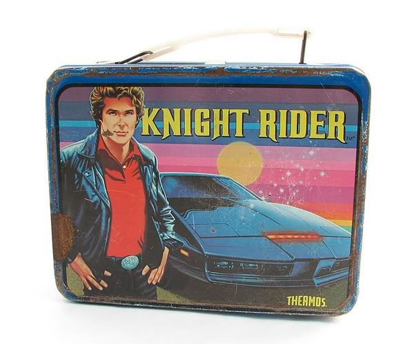
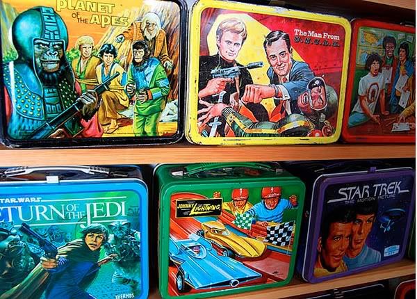
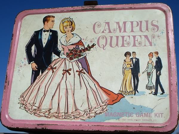
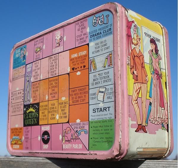
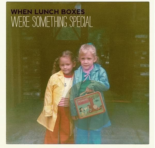
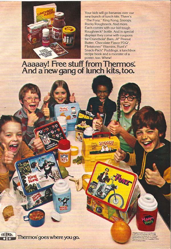
Back in the day, your lunch box was something you treasured. You eagerly picked out a new one each year…and carried it with a sense of pride. For some reason I feel like lunch boxes are much more utilitarian now. Sure, they still have cartoons and what not on them, but more and more kiddo’s on the elementary school playground have unbranded nylon totes. Even bento boxes, which can be darling, don’t have the same cache and magic of a Knight Rider lunch box, ya know? This photo sums it all up for me—and totally reminds me of my brother Karl. He worshiped Star Wars and looooved his awesome Super Friends lunch pail.


image: Benjamin_oderwald

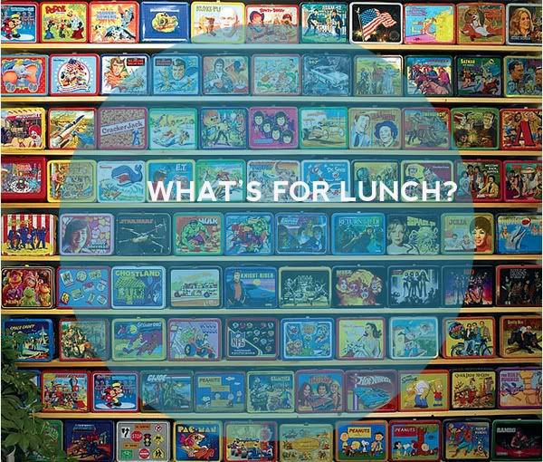
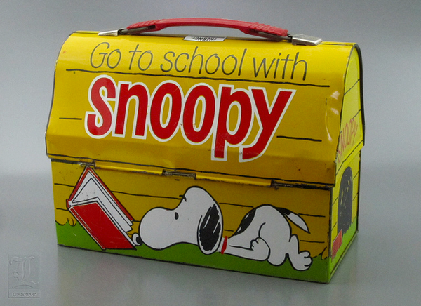
Lunch boxes were SUPER trendy amongst collectors back in the 90s….kinda like Pez. Prices became so inflated that I wouldn’t even really look at them, knowing they would cost a pretty penny. But the other day I stumbled upon a great Snoopy lunchbox and it reminded me that I DID still love them. What kind of lunch box did you carry back in the day?

images: lunzerland

image: Kevin Rej

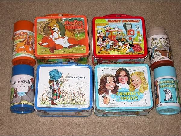
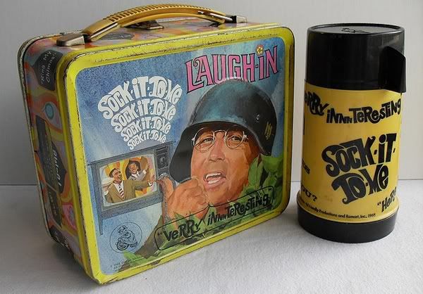
TV show based lunch boxed were especially popular in my day (the 70s). That Charlie’s Angels lunch box?? I sooo wanted one. Ironically, often lunch boxes were for TV shows that your parents would never really let you watch….or for bands you never really listened to at age 8 (KISS, Charlie’s Angels, the A-Team….LAUGH IN!). But you knew of them through pop culture and you wanted to be a part of it all!

image: christian montone

image: Sarah Kennon


image: gtykal


image: apricot x

image: dani senske


image: fleece boy


image: stacy monakey

image: Pastor Future

I understand why they have evolved….tin lunch boxes get a little rusty, and nylon/vinyl is easier to clean. But man I miss those days. Wolfie likes his lunch box, and we got him a sweet Pokemon one, but I know he doesn’t feel that same reverence we all did when we were kids.


image: big brown house


image: Greg Koenig

Do you have these same memories? What was your lunch box? And how about your kiddos….what are they carrying their lunch in these days? I’m curious!

Meet my favorite luggage.

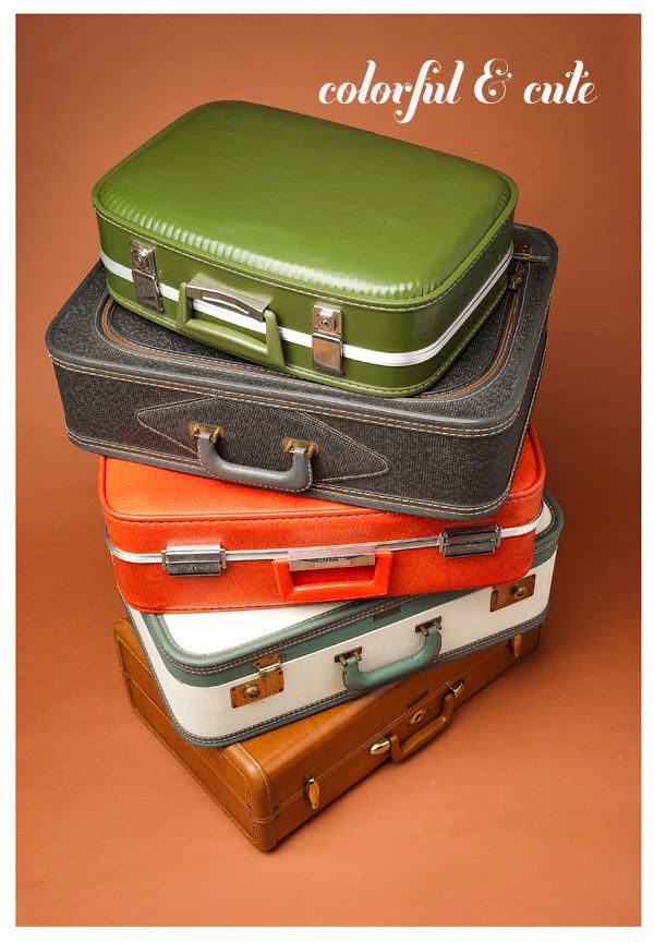
Ahhhh, vintage luggage. How I love ya. Nowadays suitcase are all about being practical (and about 90% of ’em are black). But back in the day, suitcases were colorful and stylish. Your luggage was almost like a fashionable accessory—and helped to make the whole travel experience a more stylish event.


image: brian greathouse

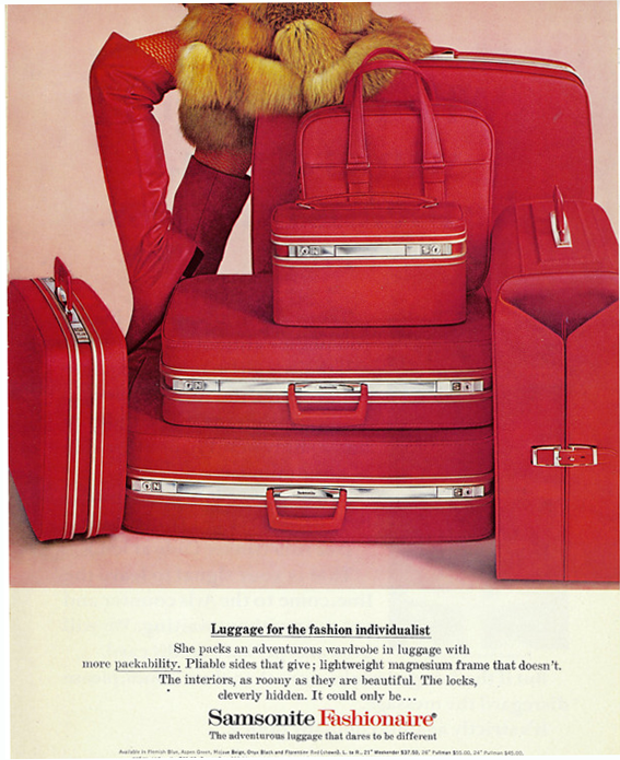
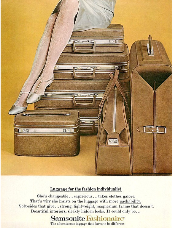
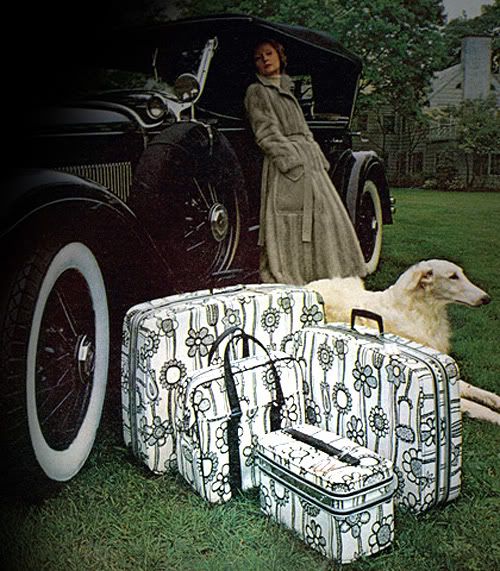
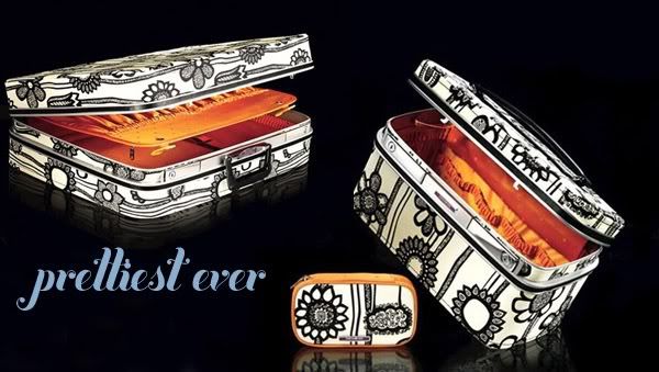
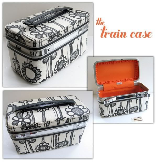
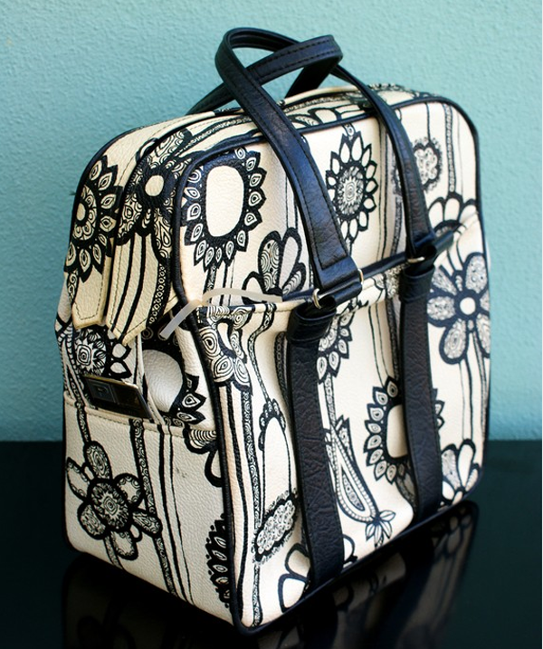
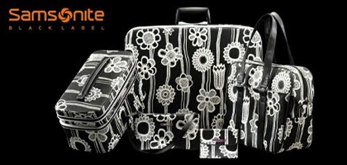
There are so many excellent vintage suitcases out there but one of my  all time favorite vintage luggage lines was the Samsonite Fashionaire of the 1960s. The Fashionaire (see? already the name is more stylish!) came in a variety of hardshell cases (including an adorable makeup case/train trunk) and was produced in bold colors like hot pink, electric blue and cherry red. With a tagline, “Luggage for the fashion individualist” the Fashionaire was marketed to women as an extension of the stylish woman’s wardrobe.

But of all the Fashionaire colors, my tippy top favorite is the kicky Black and White pop floral. The distinctive pattern is so unique and contrasts amazingly well with the bold orange lining. Loooooooovely, no? This version tends to be the “go-to” vintage suitcase for stylists all over the world. If you keep your eyes open you’ll see it frequently used in commercials, music videos and fashion spreads. Although none are quite so glamorous as the original ad…..didn’t every stylish woman own a Model-T and an Afgan dog??

Contrary to popular belief, this is NOT a Markimekko pattern! You’ll often see it listed as such on ebay or Etsy, but this is not true. I suspect some enterprising eBayer added it to a listing in hopes of drumming up interest ages ago—and thus a vintage rumor was spawned. It was, in reality, simply a pattern created by the Samsonite design team.

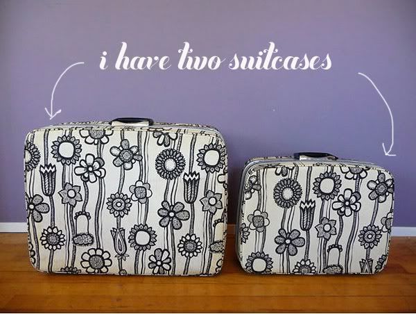
I have four different pieces from this line and they just make me so darn happy.


And I also have the travel tote bag, which is by far the most practical and one of my favorites.

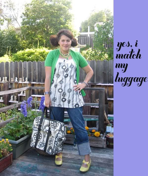
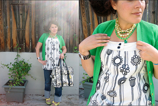
No, your eyes are not playing tricks on you! A few years ago I found this awesome little tunic from Delias that had the exact same pattern on it. I guess one of their designers was “inspired” by the luggage. I think it’s pretty fun!

So as much as I love my vintage luggage, I have to be honest—I don’t love schlepping it around town. If you own any vintage suitcases then you know the ugly truth. They weigh a freakin’ ton and are utter back breakers—not very practical. I learned the hardway on a trip to Vegas with the Devil-Ettes. I saucily sported my pink hardshell Samsonite suitcase. And while I got plenty of compliments on it, dragging that thing from the airport to my hotel was not a pretty picture—sweaty sequins do not a glamor girl make, my friends! I think it weighs 10 pounds EMPTY. So I rarely use it, unless i’m going on a road trip.

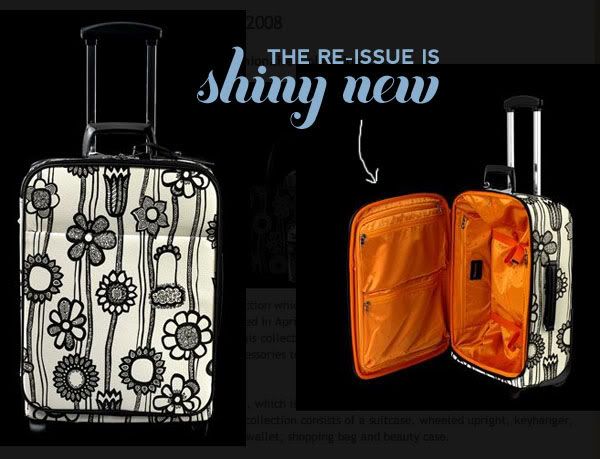
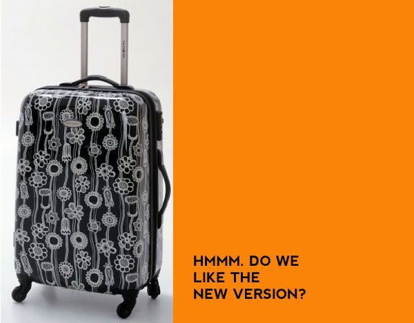
A few years ago Samsonite re-released the Fashionaire line as part of their Black Label Collection. They only created a limited number of the hardshell suitcases, traincase and flight bag…..but what was interesting was that they “re-imagined” the bag as a roller suitcase! It’s a little weird looking but I found it pretty cute. Christina Ricci was the spokes model for the launch and I saw photos of her rolling it around. In addition to the iconic “Black on White” pattern, they came up with a snazzy “Black on White” version (which looks much like an x-ray of the original). The suitcases cost a pretty penny but are mostly sold out.


You can still find the black roller cases online. They are made of a newer shiny “hardshell” material.

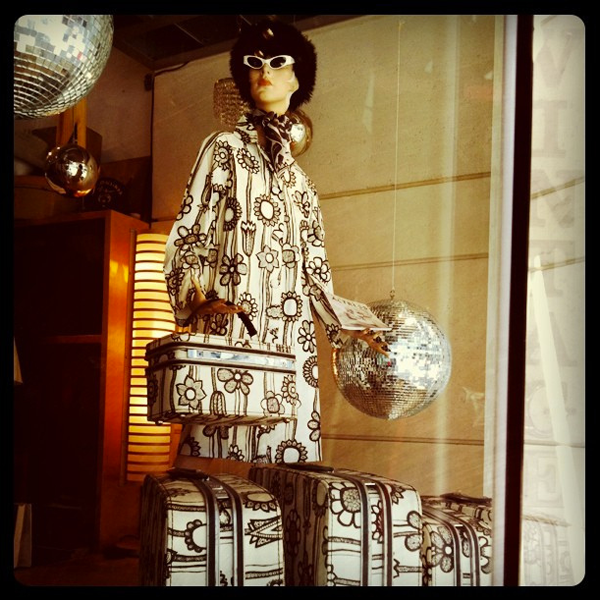
If you’re intrigued by the vintage Fashionaire (and you know you are!) you can often find them on eBay and on Etsy. And if you’re reeeally lucky, you might even spy this uber rare raincoat—which the vintage shop on the way to my work had in its window earlier this year. Ahhh, if only.

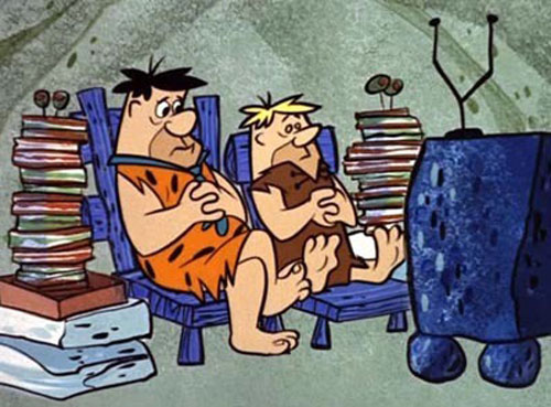
The OG Stone-Age Family.

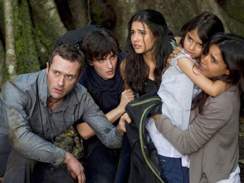
Last night, I watched the highly anticipated Terra Nova. It is set in the future where the earth and civilization is pretty much dying.    Overpopulation equals extinction and within the first five minutes they take a little girl away from their family.  (Sob!)

But in the future, scientists have found a way to find a fracture in time and have sent a pioneer team back to the Stone Age.  With Steven Spielberg as part of the team behind Terra Nova, a lot of people were think it’s going to be like Jurassic Park intertwined with unique dynamics of a family living in the Stone Age. I however kept thinking of another Stone Age family…

Sorry, but I’ll live in Bedrock any day of the week over Terra Nova. (Sorry Fox.)

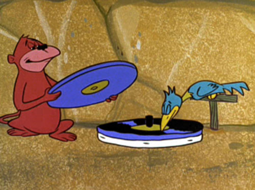
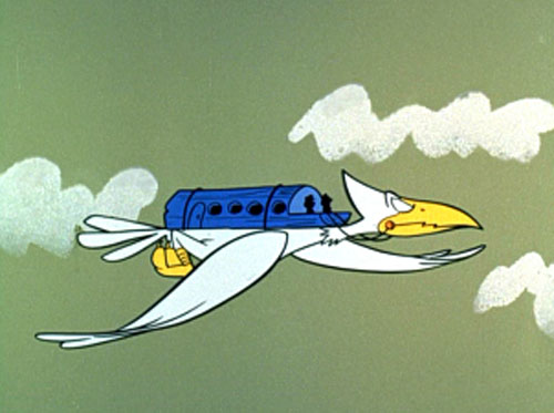
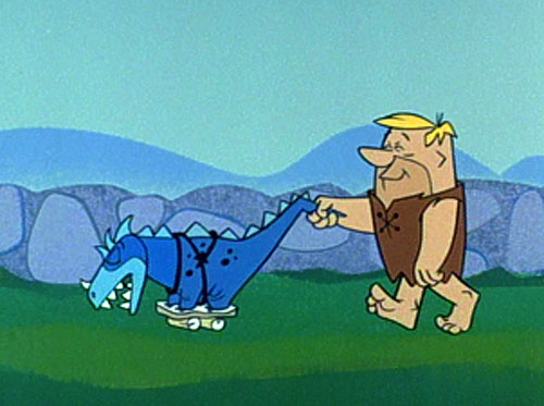
I loved the pre-historic version of our modern day appliances. I wish I could find an image of the water buffalo dish washer! Sigh!

Poor turtle!

I also loved when they gave popular stars of the time the “Bedrock makeover” Genius. Beat that for special guest stars, Terra Nova!

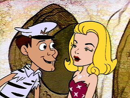
Like Alfred Hitchock… Or Alvin Brickrock as he was known in the B.C. years.

Darren and Sam from Bewitched!

Ed Sullivan

Ann Magrock (Ann Margret)

And my favorite “Stony Curtis”!

Hee hee!  I’m sure you all heard about the new version of the Flintstones that will be coming out in 2012, but still… I think the original is the best.

Your thoughts?


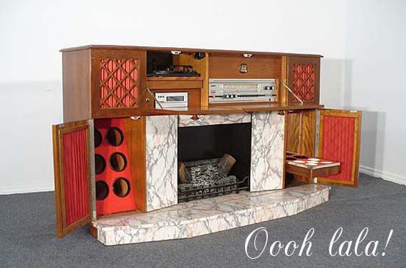
The World’s Hippest Fireplace.

It’s a lovely Friday evening. You’re playing bridge with The Johnsons (Bitsy made her infamous sandwich loaf). You stroll over to your toasty hearth…but hold on a moment…oh ho ho! What’s this? This is no ordinary fireplace….

It’s a full on freakin’ entertainment system—AND BAR!!

Yup. A freestanding vintage fireplace unit from the 1950s. Faux marble, wooden detailing. Pretty cool. Can you just imagine how cool the couple that owned this thing was??

Vintage Monday :: Magical Paint By Numbers

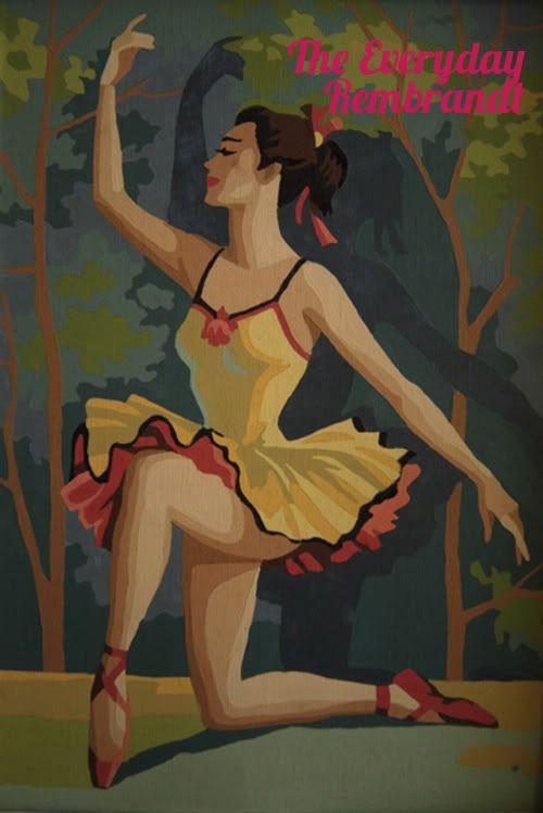
Ah paint by numbers! What was once a thrift store classic has now risen up in the ranks and become a coveted piece of Americana history. Friends, I don’t know if you’ve ever tried to actually PAINT a paint-by-numbers, but it ain’t easy! For those who don’t know, Paint-By-Numbers are black and white canvases bearing color-coded numbered areas for the “artist” to fill in with appropriate colors. The daintiest of paint brushes and a steady hand are critical. When done well, I think they have a uniquely haunting quality. There is just something about them that makes you look twice!

So how did paint-by-numbers become such a popular fad? Let’s take a little look see!
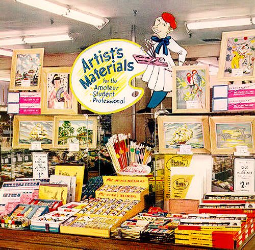
It all began at the Palmer Paint Company in Detroit, Michigan. They introduced the first paint-by-number kits under the label Craft Master at the New York Toy Show in 1951. Artist Dan Robbins (a Palmer Paint packaging designer) is credited with coming up with the idea and creating many of the initial paintings. Robbins was inspired by childhood memories of coloring books and Michelangelo—who famously assigned pre-numbered sections of the Sistine Chapel to his students to paint. The first Craft Master set was “The Fishermen” and included a rolled canvas stamped with the numbered outline of the scene, mini tubes of oil paint, and of course an artists palette.

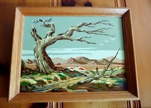
Popular subjects ranged from moody landscapes and seascapes to playful animals, ballerinas and still-life floral bouquets. Paint-kit box tops proclaimed they would make, “Every Man a Rembrandt!”
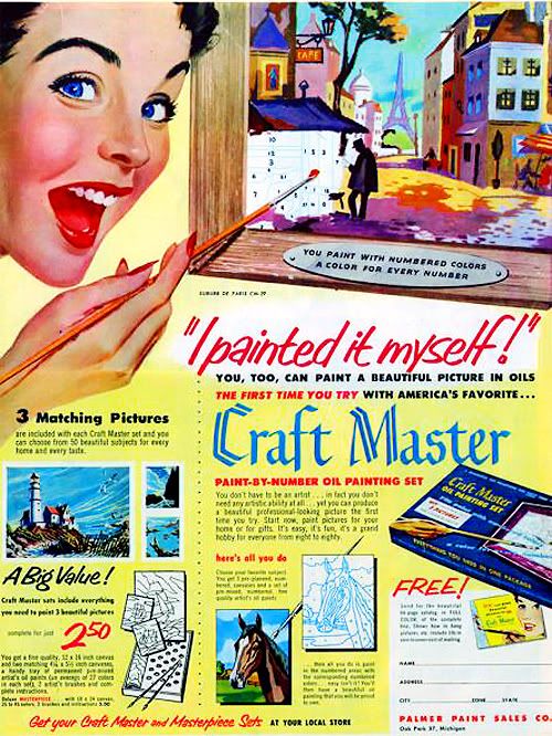
Paint By Numbers were not a critical success—many saw “number painting” as not only a novelty but a symbol of the “mindless conformity” of 1950s America. At the same time, the general public embraced them whole heartedly. There was something extremely charming and appealing about the paintings. They invited people who had never held a paintbrush in their life to suddenly feel creative .

“Most people think paint-by-numbers was an immediate success. Not true! In the beginning we couldn’t give our sets away. It took almost two years to get our paint-by-number business off the ground. When we finally did, it took off like a rocket. All we could do was hang on for dear life.”   —Dan Robbins, What Ever Happened To Paint-By-Numbers?

By 1954, Palmer had sold an unbelievable twelve million kits. They eventually became so popular that the White House even hung paint-by-number canvases created by J. Edgar Hoover and Nelson Rockefeller in the West Wing corridor. Amazing!
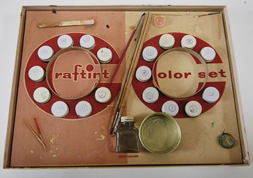
As the years went by, and more competitors started popping up, the line expanded to include celebrity portraits (what I would do for a Liberace Paint-By Number!) and more “exotic” subjects, like Balinese dancers and more tropical landscapes.

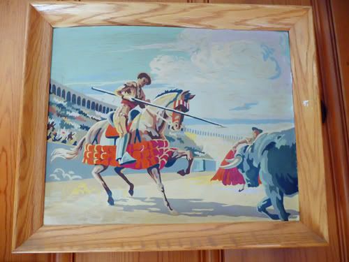
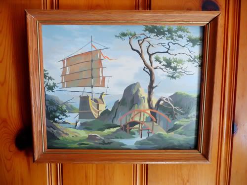
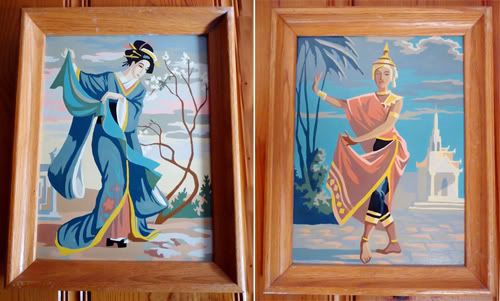
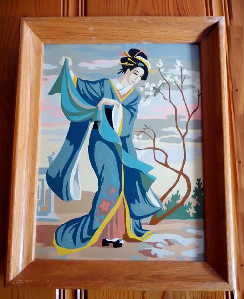
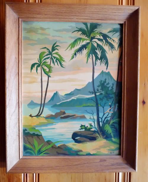
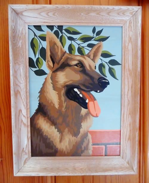
It’s interesting to note that while the original Craft Master kits were printed on rolled canvas, they eventually transitioned to the now-familiar press boards with light-blue outlines. They also switched to acrylics rather than oil paint. The original canvas paint-by-numbers are highly sought after and often worth more than their press board counterparts. I still love them all! Here are some from my own personal collection:
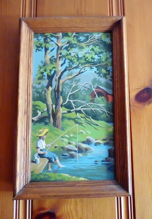
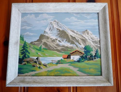
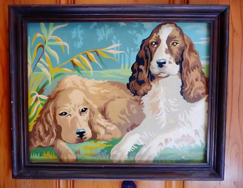
The “Far East dancers” and the doggies are my favorite….please note that the fella that completed the one above “signed” it. I love that.
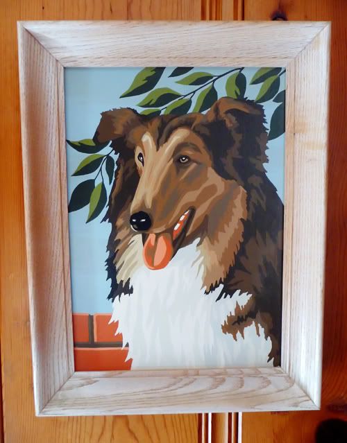
In the 1970s and 80s, the sets started to get a little more childishly kitschy….teddy bears, Snoopy and even TV shows like Mork and Mindy got the “PBN” treatment. While I love my 70s kitsch, I think these later versions are no where near as cool as the originals. The originals were attempting to be authentic—there was nothing tongue-in-cheek about them. Nothing beats the subtle elegance of a stoic collie or a dramatic sunset on a western prairie.

I love our paint by numbers and especially love to think of the back story each carries. Who was the intrepid artist who lovingly and painstakingly dabbed color onto canvas? It intrigues me no end! Paint-by-numbers are much harder to find in the thrifts today, and have moved up the ranks to be a genuine collectible.

And to lend a little credibility to their place in American history, there was a Paint By Numbers exhibit several years ago in 2001 at the Smithsonian. Not too shabby.

Read more at Collectors Quest and the PBN Museum.