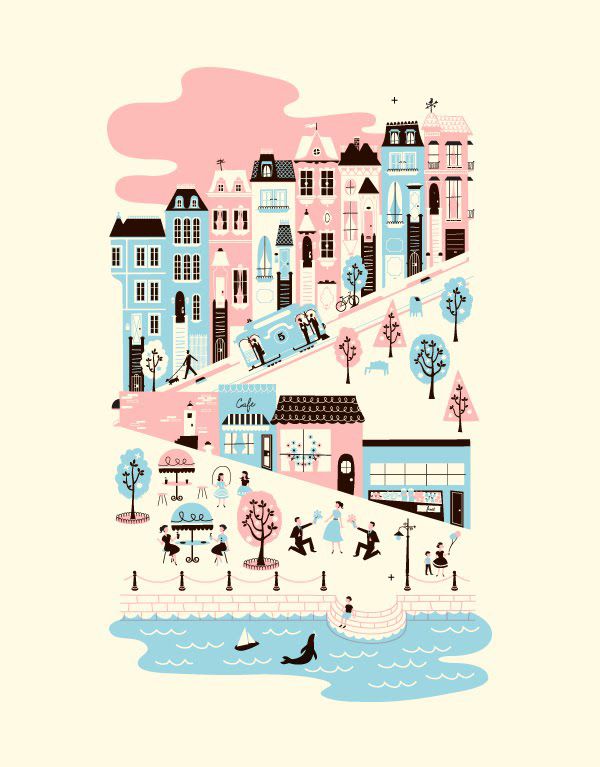
I just love mid-century graphic design—and finding it from other countries is especially satisfying. Just look at these wonderful images I’ve collected over the years from various German magazines and print ads:


Tasty!

twentythirteen domain was triggered too early. This is usually an indicator for some code in the plugin or theme running too early. Translations should be loaded at the init action or later. Please see Debugging in WordPress for more information. (This message was added in version 6.7.0.) in /home/alixndottie/modernkiddo.com/wp-includes/functions.php on line 6170
I just love mid-century graphic design—and finding it from other countries is especially satisfying. Just look at these wonderful images I’ve collected over the years from various German magazines and print ads:
Tasty!
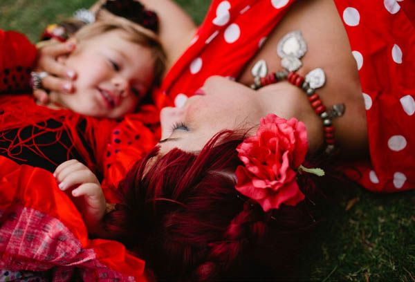
Photographing children can be incredibly rewarding but it’s also extremely challenging.
Hailey & Andrew are a talented photographer duo who live in Brisbane, Australia. They have two gorgeous little girls (and one mischievous Great Dane!) and their work just radiates happiness.
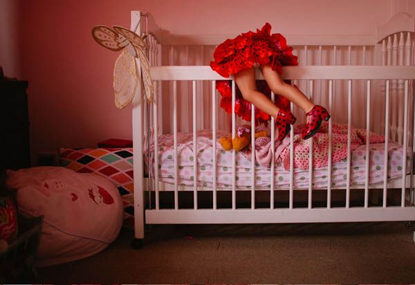
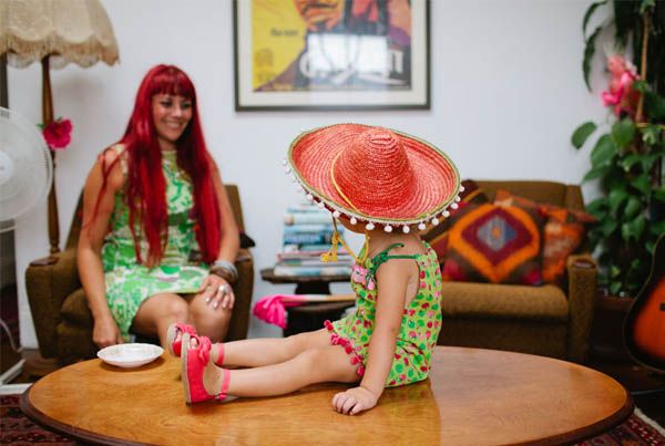
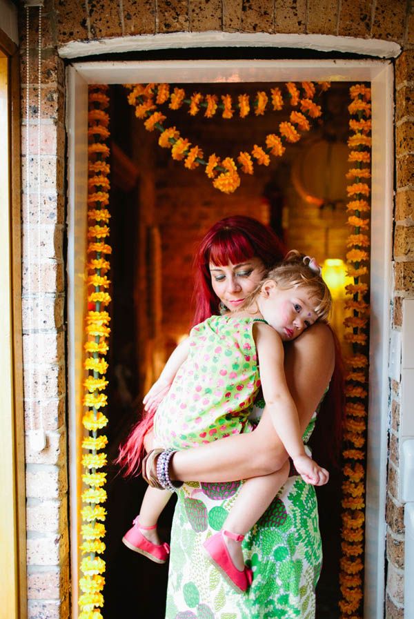
The wonderfully sweet Hailey sent me this beautiful ‘Mama & Me’ shoot with the very lovely Kass and her sweet little girl Paloma. I’m so taken with this shoot! It clearly reflects their personalities and is just so colorful and fun! There’s nothing wrong with a more formal style portrait—anything that captures your family and a moment in time is a wonderful thing—BUT I have to say this more editorial style approach is so playful and really captures the SPIRIT of the family!
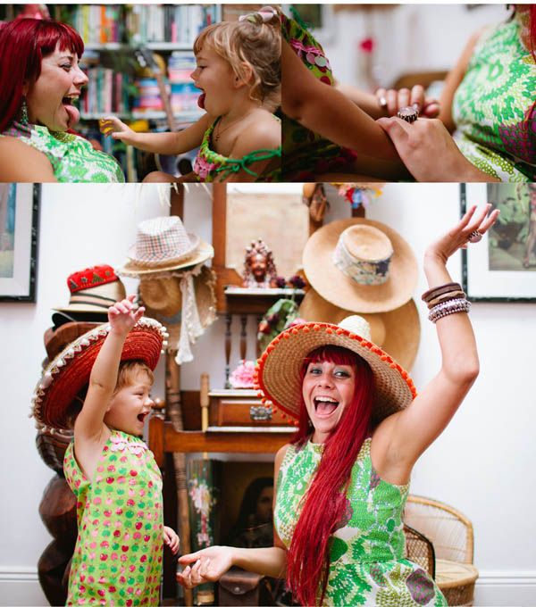
I had a chance to chat with Hailey and asked her if she  enjoyed shooting families (which was probably a dumb question—one look at these photos and you can just see how much fun they had!). Here’s what Hailey told me:
“I think there is nothing I like photographing more than families! I am obsessed with capturing parents enjoying their kids and kids enjoying their parents or siblings. It makes my soul leap eveytime I get these types of images. It is definitely easier to get two people to engage really well with each other but I really love the challenge of seeing a whole family engaged and delighted in one photo. It is something I love to chase!
I feel like the images of a child alone are lovely but to be honest, they don’t excite me as as much personally [as family photos] because it is the joyful connections between loved ones that really makes me happy!”
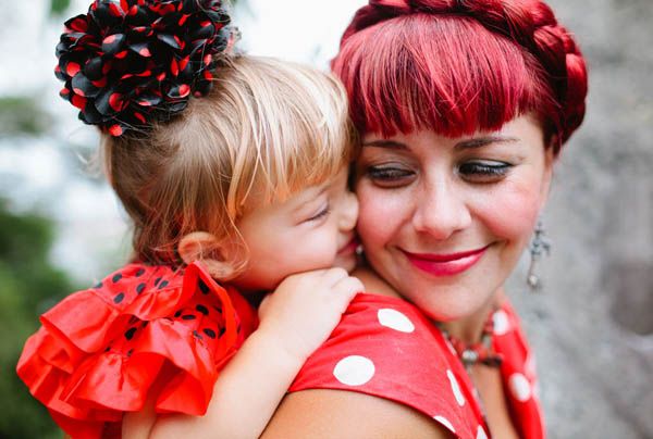
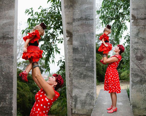
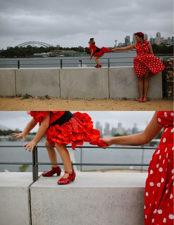

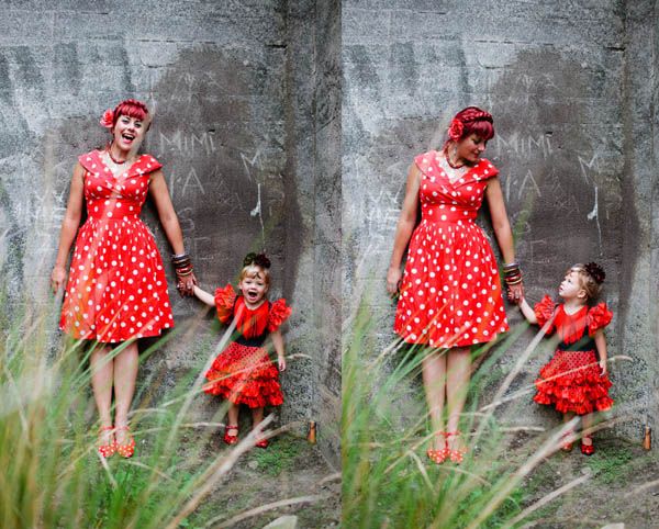
Um, the polka dot flamenco shoes?? The matching dresses?? HOW AMAZING! I think Hailey said it best, “Our job is to capture joy and fun moments in peoples lives through photography and film…and family photography is the best kind of fun. Kids make everything very exciting and unpredictable and oh so hilarious!”
This really makes me want to do a fun photo shoot with Greg and Wolfie. We take tons of pictures of Wolfie. And we have photos of me and Wolfie….and of Greg and Wolfie….but really hardly any of the three of us. Formal portraits are great, but there is something about this more free form shooting that just captures the laughter and life of each family so perfectly. Have you ever done a more editorial style photo shoot? Would you ever?
By the way, If you are interested in having your own portrait session but bummed because Hailey lives allll the way in Australia, YOU’RE IN LUCK! Â Hailey and Andrew are going to be in the states this summer! Here’s their travel schedule:
Melbourne 20-25th April
Newcastle 28th April – 4th May
New York 9th – 15th June
Los Angeles 19th – 24th June
Sydney Mid to late July.
You can reach them via their site. Thank you Hailey for sharing these wonderful photos!!
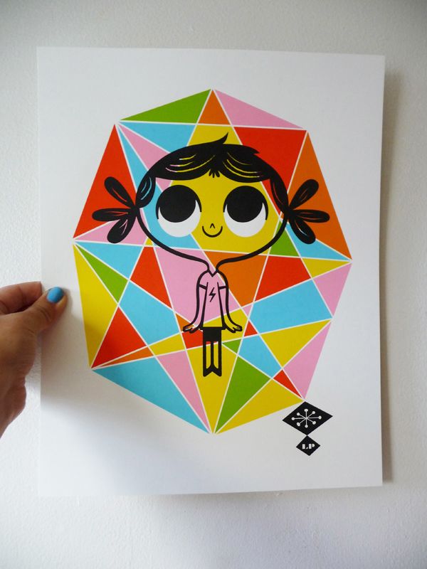
I know. The word magical. It’s kind of over used in the blogging world. But truly? These illustrations are magical. Part whimsical. Part sophisticated. Totally vintage-inspired yet somehow utterly modern. Can you tell I love them? Yes I do. But just who are the masterminds behind this fabulous work??
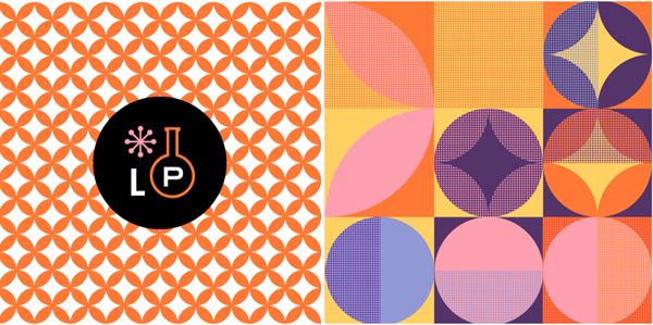

This awesome husband and wife duo are the brains behind Lab Partners (aka LP) and the most wonderful, fantastical illustrations you’ve ever seen. Ryan and I worked together at Goodby and I can tell you for certain he is one of the nicest, coolest guys you could ever hope to meet. We had lunch a few weeks ago and I finally got to meet Sarah too and she is not only adorable but every bit as awesome as her partner in crime—I think I could have sat with them all day trading silly stories.
So who are these lovely people? Well, Sarah originally hails from Connecticut where she grew up dreaming about being a Zoologist/Disney animator (my kinda girl!).  Sarah has previously worked as a designer at Berkeley agency Tomorrow Partners and you probably have seen some of her exquisite letterpress work for hip stationer Hello!Lucky. Ryan was born in Tokyo and grew up all over the world—living in places like Germany, Hawaii and Texas. He’s also worked as a designer/art director  here in San Francisco, which was how we originally met.
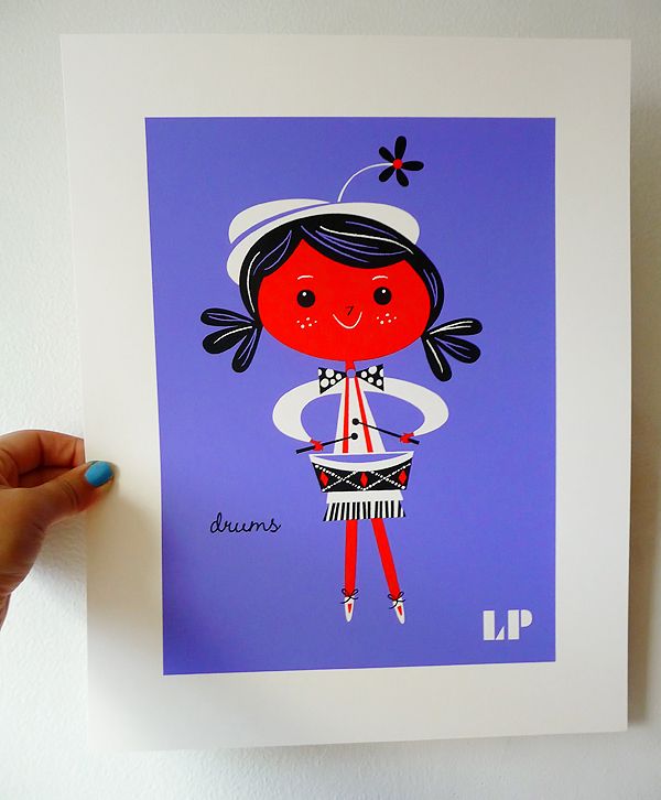
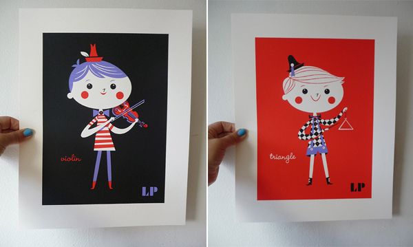
Thanks to their generosity, I am now the proud owner of a nifty selection of LP prints, and they’re all SO GOOD I just had to share them with you. They have two cool new series I think you guys will love!
1. All Together Now. This is a music inspired series that is colorful and vibrant and would look fantastic in a children’s room or simply a playful home. There are five little merry musicians to chose from!
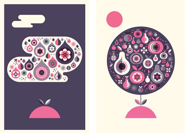
2. California Gold. This is a really incredible collection. The large prints are done in black and white with a fabulous gold metallic ink that looks gorgeous. The series is an homage to the many natural wonders of California. The best part? 5% of all sales are donated to the California Nature Conservancy. I love this. Super chic and sophisticated.
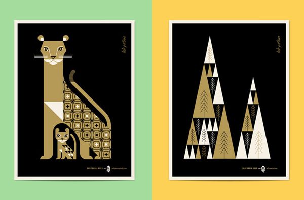
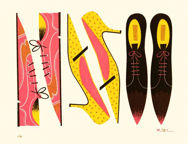
3. Hunt & Gather. This is an older series, but was so popular they have re-released them. Each pretty little letterpress piece is inspired by the thrill of treasure seeking at flea markets and all the fabulous oddities found in between. I just adore these shoes…but every piece is really fun.
See? Aren’t they awesome??


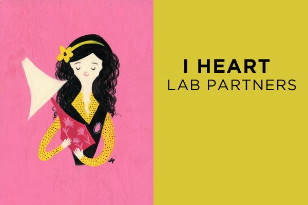
Which is your favorite? The playful little violin player? The sleek mountain lion? Hmmm. So tempting to get THEM ALL. You’ll definitely want to visit their site. And you’ll DEFINITELY want to order a print from their shop. They are simply gorgeous! Thanks so much Sarah & Ryan for letting me share a little bit of your magical world with everyone! I’m looking forward to our next lunch date and trading more kooky cat stories. {And O’Malley says ME-ROW!}

Straight on the heels of Dottie’s wonderful post about the Color Corp Project in Oakland, California, I thought it would be cool to take a look at a similar project that is already completed. The Favela Painting Project in Brazil is simply stunning. A favela is a Brazilian slum. Most of the buildings are run down and neglected. The Favela Painting Project has made it their mission to create striking artwork in these neighborhoods by collaborating with the local people—and using art as a tool to “inspire, create beauty, combat prejudice and attract attention”. Not a bad mission in my book!
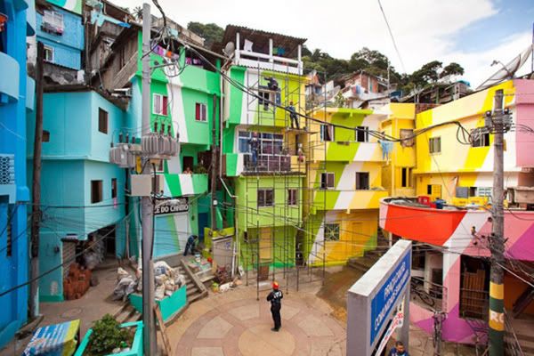
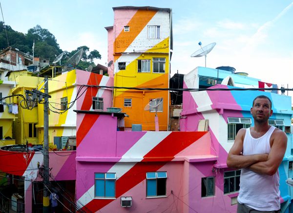
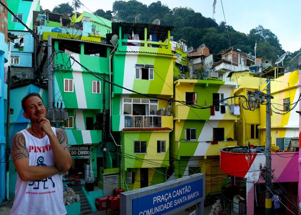
“Sequestered within the city of Rio de Janeiro, two men are giving the poor, compact community of Santa Marta a radiant makeover. Dutch duo Jeroen Koolhaas and Dre Urhahn originally came to the favelas of Brazil in 2005 to film a documentary about hip hop for MTV, but after MTV left, they decided to stay. Soon after, the Dutch duo (known simply as Haas&Hahn) began Favela Painting, an organization dedicated to bringing outrageous works of art to unexpected places.† — Flavorwire
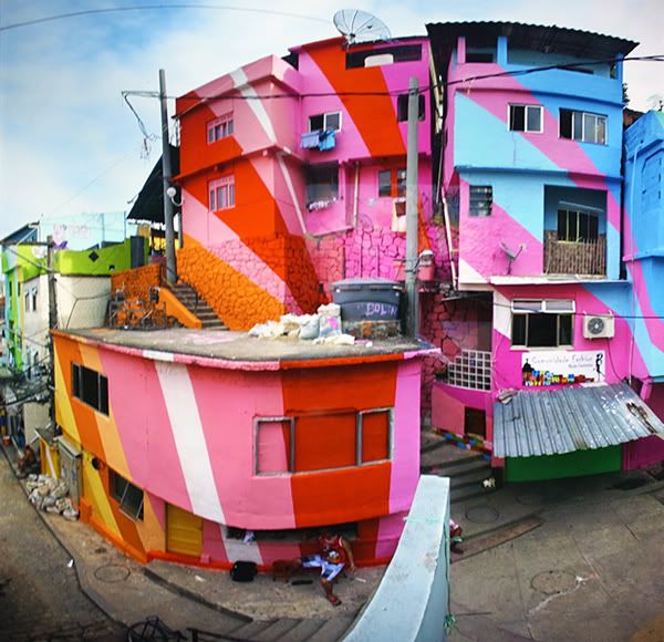
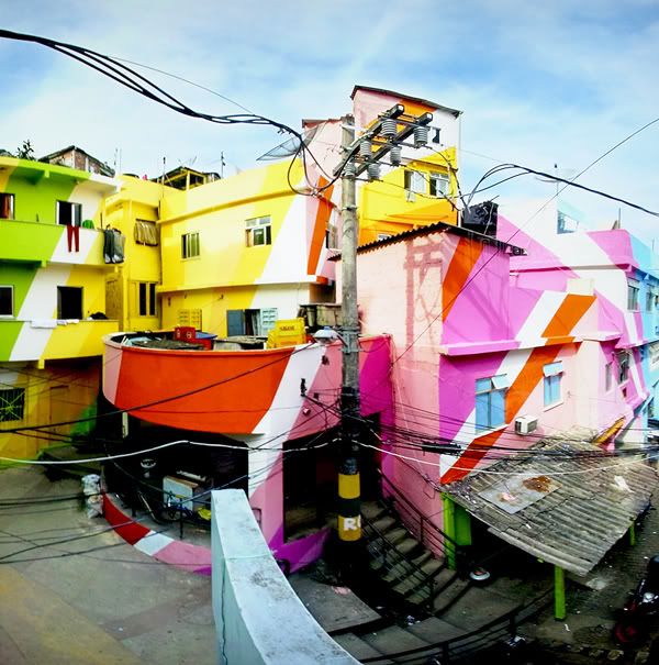
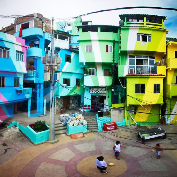
Can you imagine your neighborhood being transformed like this? Pretty glorious!

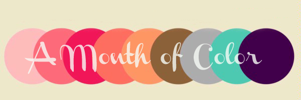
Who doesn’t smile when they see a wall of turquoise? Or driving by an unexpected pink house or spying a red door on a walk? Color, whether we realize it or not, impacts us more than we know.
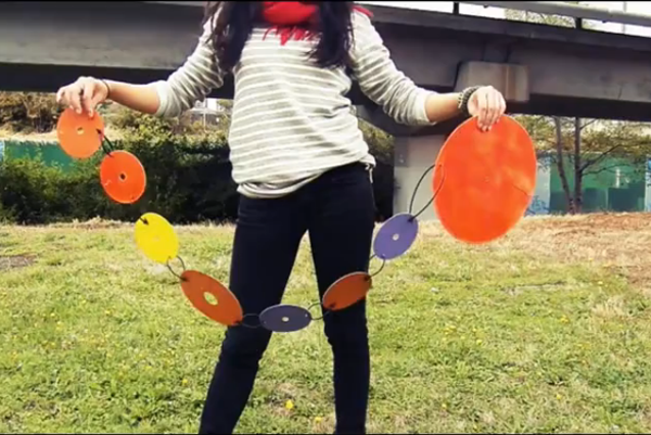
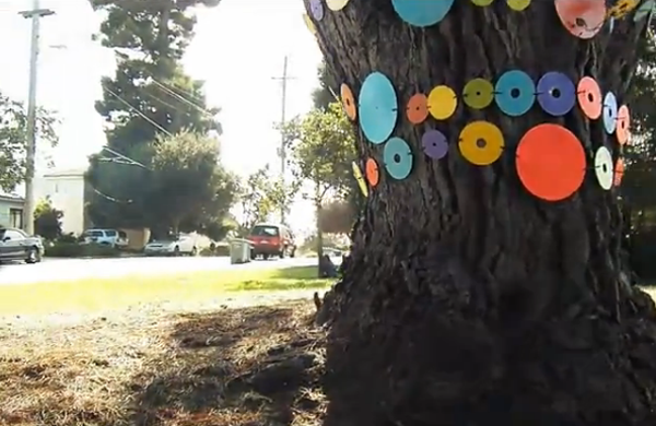
Laura Guido Clark, a Bay Area design and color consultant  has a mission to bring color into places that need it most. In 2011, Laura founded Project Color Corps, a volunteer nonprofit organization dedicated to creating change by painting inner city neighborhoods with color and pattern that impart positive messages of optimism and hope. They began with a wonderful series of public art projects called “Random Acts of Color” (using recycled 45s and CDs) but now they’ve set their sights higher.
Project Color Corps’ first major initiative will be to paint  E.C. Reems Academy,  a K-8 extended elementary charter school located in one of California’s most at-risk and disadvantaged communities: East Oakland. One of the school’s guiding principles is: “Encouraging creativity to bring forth new ideas and achieve higher levels of living.â€
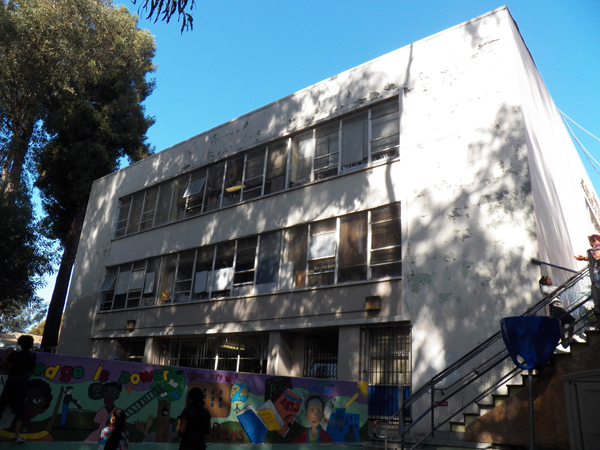
And yet, the school is visually depressing, with layers of peeling paint on a dull exterior. Lisa Blair, its dynamic founding principal, explains,
“Our community is very drab. The colors are mostly tans and browns—like prison colors. This is the world our children live in: one with no vibrancy, no direction, no enthusiasm, and very little hope. If you’re sent from a home in disrepair to a school in the same condition, the message is ‘You are not worth anything. There is no place for you in this society and no one cares.’ But if the opposite occurs, if our kids were to walk into a school that is inviting and bright, the message becomes, ‘Come in, dream big. It’s your world, not ours!â€

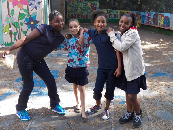
These bland and sad looking buildings hardly reflect the hope and joy of these awesome kids.
Here is a wonderful video about the project that is totally worth watching if you have a few minutes.
COLOR SPEAKS: Project Color Corps and the E.C. Reems Academy from Project Color Corps on Vimeo.
To transform the E.C. Reems Academy, Project Color Corp needs to raise $50,000 by May 2012. Every dollar can help! Won’t you please think about making a donation today? They need green. Glorious green!