All posts by Alix

Friday Link Hootenanny :: Cool Things to Browse


image: Erin Hanson

Oh happy joy! We are having GLORIOUS weather here in California. FINALLY! We had weeks of rain and cold and fog. And the sunshine is soooo welcome. The only person not thrilled with the heat? Sammy (our dog….he’s got a big ol fur coat!). We have a busy weekend….little league games, science fair project prep, greg’s band has a gig….lots going on! Also, I’m super excited because my parents are coming out for a visit next week. We’re calling it a “work visit” because they have agreed to help me clean out our basement—aka the vintage wasteland. It’s a huge undertaking but one that has been YEARS coming. My friends will know, I’ve been complaining about the mess down there for ages. AGES! So look forward to some updates on that—and plenty of Instagram documentation of vintage treasures as they are unearthed (I’m “galexina” on there….dottie is “missdottie“). Oh, and if you haven’t entered our Big Kate Spade Giveaway, you MUST! You have til this coming Thursday at 11:59pm, PST.

OK. Continuing on with our Month of Color, some super bright links for you this week! HAPPY WEEKEND!

1. RAINBOW ART

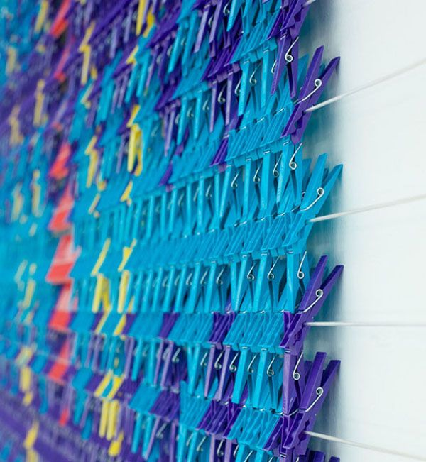
Crafted out of rows of plastic clothespins, Peg Carpet was created by Dutch art collective We Make Carpets and is simply incredible. (via plentyof colour)

2. RAINBOW CHOPSTICKS
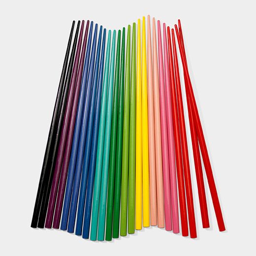
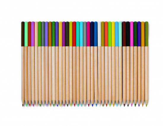
Color, color, color. These chopsticks would make any meal more fun. They’d look awesome in a cup in the center of a table.

3. RAINBOW EMBROIDERY
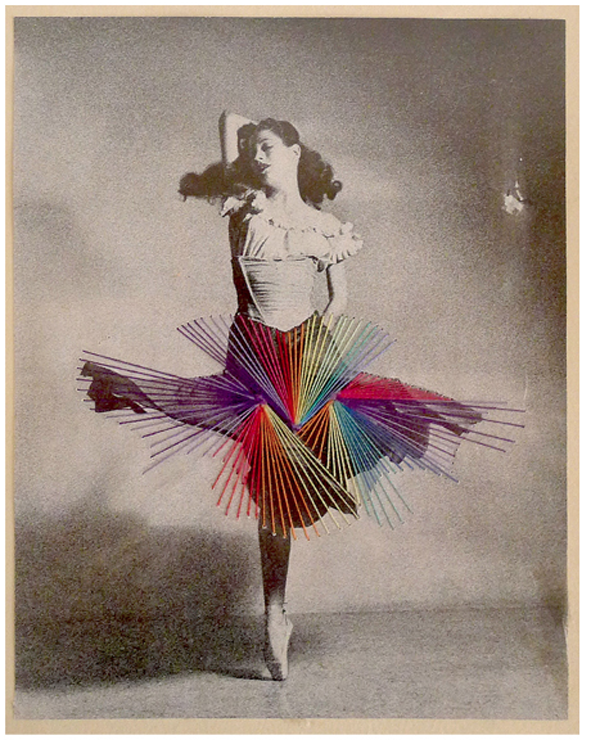
This mixe-media artwork by Jose Romussi is so pretty. (via whorange)

4. RAINBOW MARNI CHAIRS


I love Marni’s shoes and handbags (even though I can’t afford to buy one). Now they’ve created something else for me to covet— a collection of 100 colorful wicker chairs. Each one is made by an ex-convict in Colombia re-assimilating into society. Dang. (via coolhunting)


5. RAINBOW ORIGAMI BOAT CANDLES


How lovely are these Origami Boat Candles by designer Roman Ficek? Available in six colours, they are beautifully crafted facets of thin wax. I would love to see a pool with thousands floating about… (via plenty of color)


6. RAINBOW ROYALTY
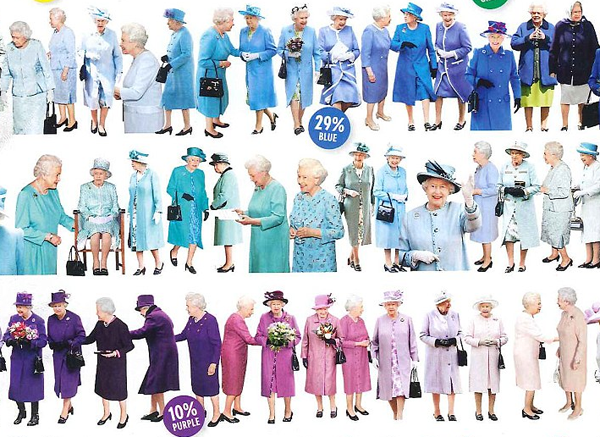
This is awesome. Vogue magazine has studied every outfit The Queen of England has worn in the last 12 months to see if they could find her favorite. Like any good royal, she favors a regal blue and finds beige boring. As well she should. See the entire collage of her outfits here. So fun!

7. RAINBOW  ART SUPPLIES


Todd Oldham + Target = Awesome. Those diamond shapes? Yeah. They’re crayons. Coming May 20. See more here.

8. RAINBOW RECORDS
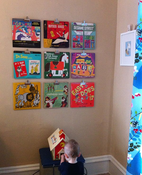
Sweet Modern Kiddo friend Deb (of Amongst the Knick Knacks) sent me this awesome photo….she used vintage children’s records to add a splash of color to her son Wolfgang’s wall. I just love how it turned out! By the way, Deb is not only sweet as can be, her son is also named Wolfgang AND her husband is also named Greg. WILD!!

9. RAINBOW RUN
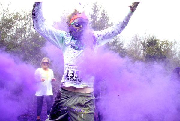
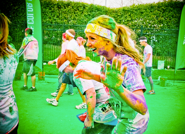
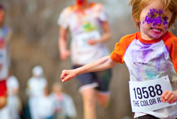
This race I saw over on Gala Darling sounds (and looks!) amazing. I’m not exactly sporty but this is something I’d love to try.  The Color Run is a unique 5 kilometres event unlike any other. As the founders describe it, the run is a one of a kind experience that is less about speed and more about enjoying a color crazy day with your friends and family. All levels of experience are welcome, all that matters is that you participate… & that you wear white clothing! Why? Because at every mile marker, volunteers throw coloured powder on the runners, turning the procession into a moving rainbow. Sign me up!
10.BONUS VIDEO: RAINBOW DANCE with OK GO

The Magical World of Barton’s Bonbonniere

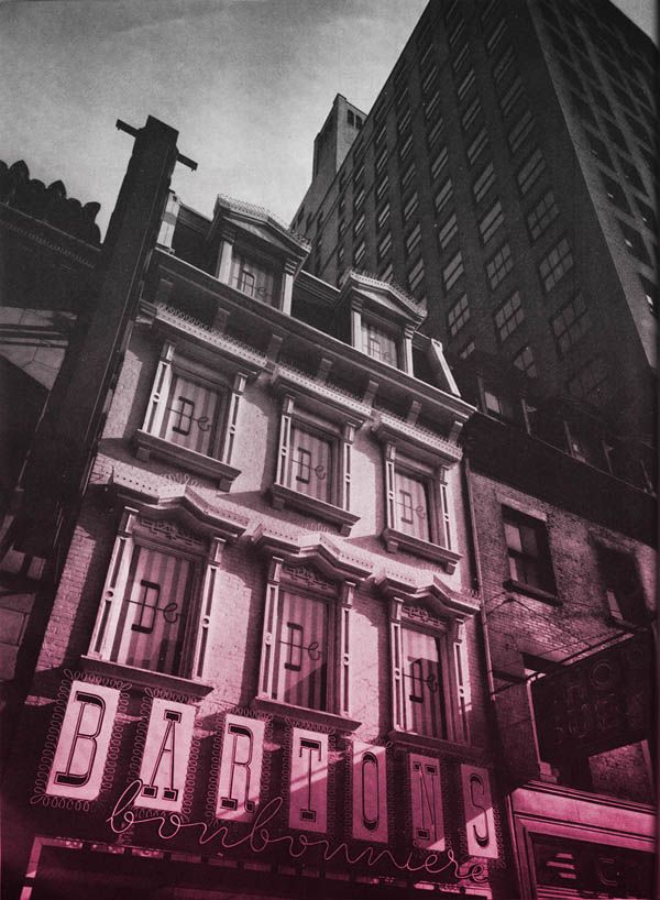
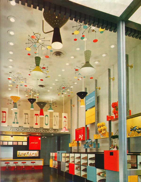
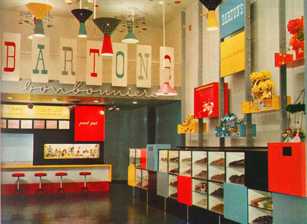
I love discovering something that just makes you go, “Oh WOW.” This is one of them! Back in 1938, Viennese chocolatier Stephen Klein started Bartons Salon De Chocolat in the New York area. They had great success creating delicious European-style chocolates and even expanded their line to produce kosher chocolates—earning a reputation in the Jewish community  for being “the” confectioner for Passover sweets. As demand increased, they opened more and more shops. In 1952, as they prepared to open their 50th store in Manhatten, they decided to give their brand a refresh. And what a colorful refresh it was!

Can you believe this place? I love it. LOVE!!!

Every colorful detail was intentional as can be—and quite unlike what was happening in architecture and design at the time. Apparently the rules for store design included missives like “the store front must look modern” “strong colors should not be used; they overwhelm the merchandise” and even “don’t call attention to the ceiling and away from the merchandise”. CLEARLY the brains behind Bartons had their own ideas!

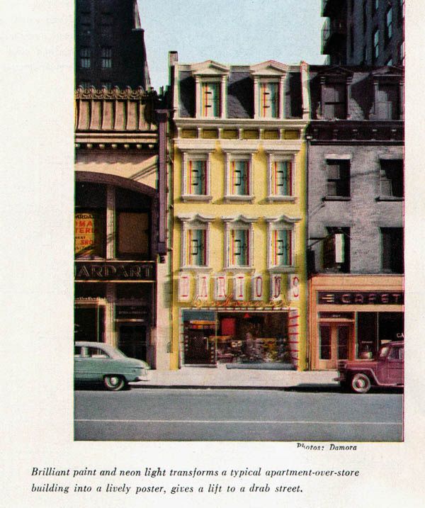
In the August 1952 issue of Architectural Forum, architect Victor Gruen said “store design is taking itself too seriously,” and was determined to turn the candy store into a visual delight. They began by giving the traditional storefront a vibrant paint job that made it stand out on the street.

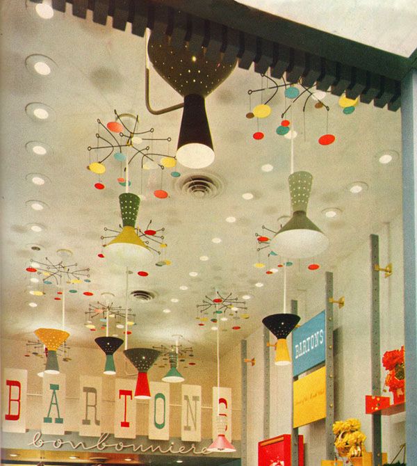
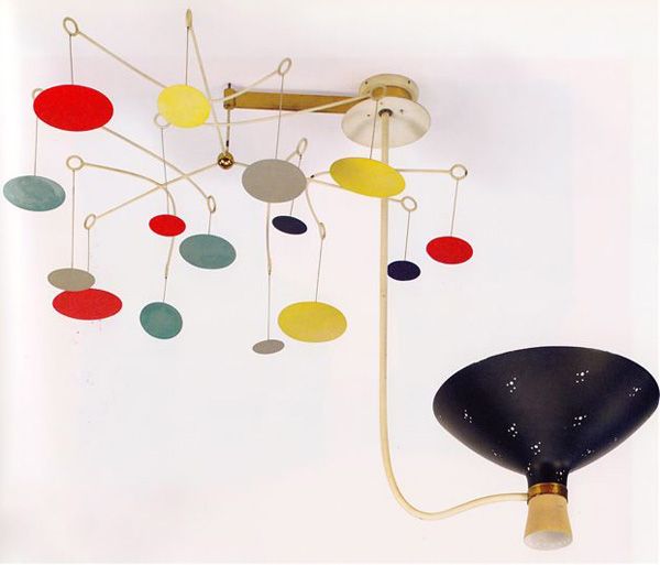
Together with graphic consultant Alvin Lustig, they set about to create a “toy shop for adults”. The plan? Clever displays, vibrant colors and whimsical Calder-esque light fixtures that were guaranteed to make customers smile and put them in the mood for some candy shopping! (It’s no coincidence that “Lustig” means jolly/lively/fun in German!)

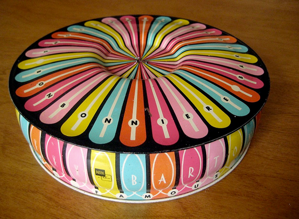
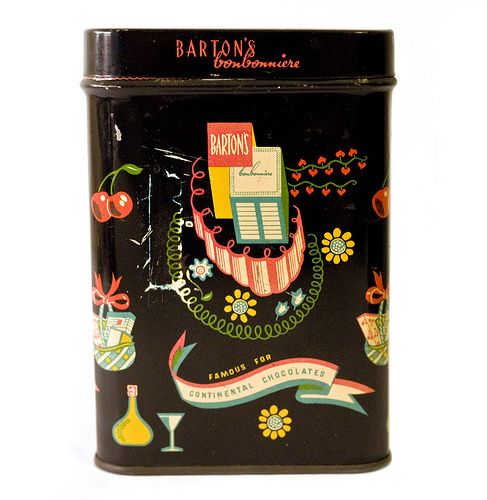
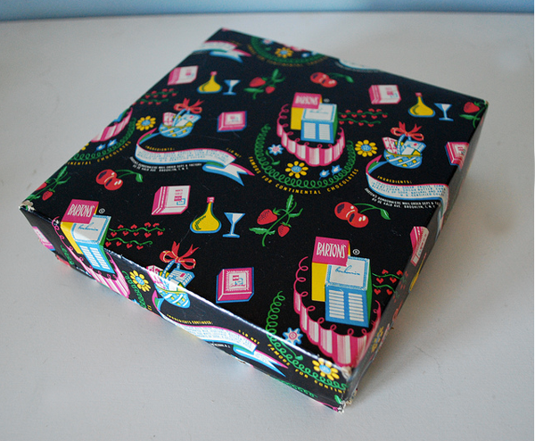
Ahh, those lamps. No detail was spared and even the candy tins were colorful and featured fun illustrations. This spectacular one is my favorite:

So there you have it. The technicolor world of Bartons Bonbonniere! It’s amazing, isn’t it?

OH! And for those of you who would like to see a little slice of this awesomeness, head on down to LACMA in Los Angeles. They are having a special exhibition on California Design and THE LAMPS are featured!


images: article / tall candy boxes / round candy box

The Big Kate Spade Giveaway. CONTEST CLOSED!

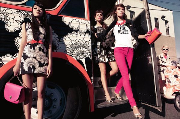
This is it! The big ol’ giveaway we’ve been yackin’ about. When Dottie & I started Modern Kiddo, we did it as a way to celebrate our love of colorful vintage, cool design and childhood nostalgia. We’ve been so blown away by all the wonderful people we have met over these past few years—you guys are so fun and supportive, we wanted to do a little something to say THANK YOU. When we decided to do a Month of Color, we knew we wanted to do an awesome Giveaway. Something fun. Something fabulous. And of course something COLORFUL! The first thing that came to mind was Kate Spade. Walking into the Kate Spade store is my happy place! It’s the ultimate eye candy experience….and we just knew a Kate Spade handbag would be the perfect little indulgence. Something we all love, but might not necessarily splurge on for ourselves.

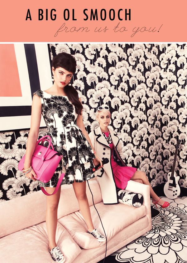
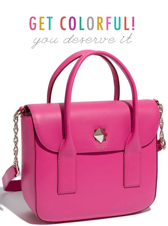
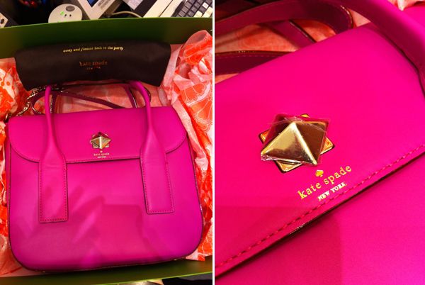
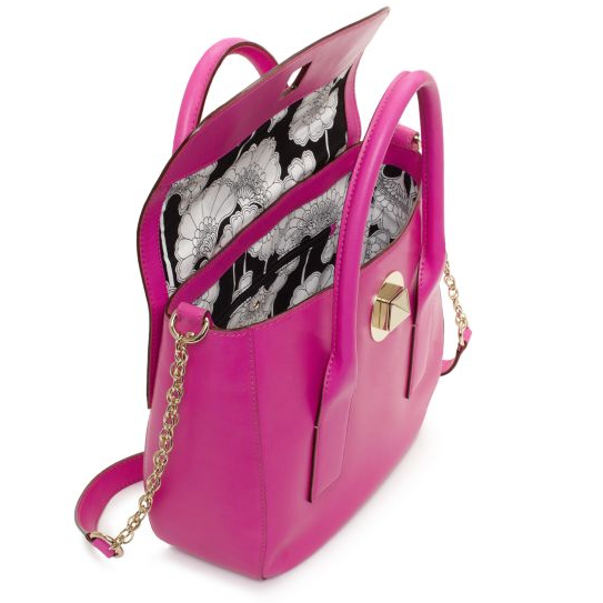
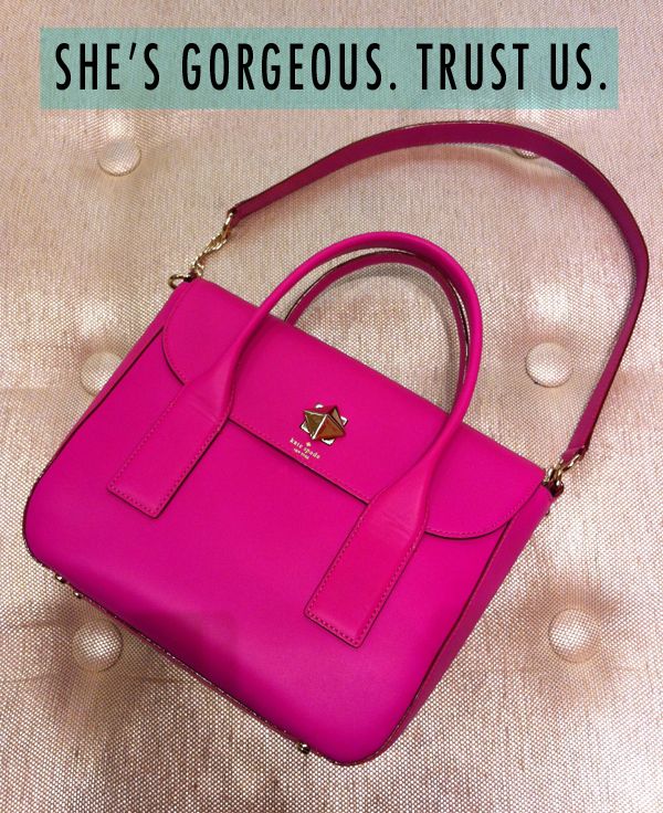
I have to tell you, Dottie and I had the most excellent time picking out something special for you! Of course, we were both immediately drawn to THIS sweet little bon bon! The Hot Pink Bond Street Florence handbag—part of the Florence Broadhurst Collaboration that has everyone swooning. The Kate Spade peeps call this bag, “The Star of our 2012 Spring Collection”. And I can see why. I’m mad for that golden turn lock closure….and dottie was dying over the gorgeous black & white floral print lining. And we both flipped for the “stunning pink” color. Yes. That’s the official name. Stunning Pink. Sigh.


It’s modern. It’s retro. It’s the Kate Spade Bond Street Bag. c/o us!

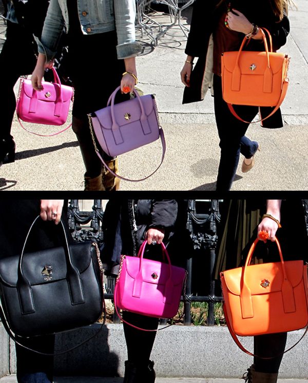
See that beauty below? That’s the actual bag you’ll be getting. Oh yes.

**CONTEST IS NOW CLOSED. THANK YOU TO ALL WHO PARTICIPATED!**
“LADIES, LADIES! HOW DO I GET THIS FAB PINK BAG??”

Easy peasy! There are five different ways to enter to win the Kate Spade handbag. You can do each of these things once.

1. COMMENT. Simply leave a comment below and tell us what your favorite color is! This is all you have to do to enter.

To get bonus entries you may also:

2. LIKE US.  “Like” Modern Kiddo on our Facebook Page. If you already “like” us, just let us know!

3. FOLLOW US. “Follow” Modern Kiddo on our Twitter Page. If you already follow us, let us know!

4. TWEET. Post a link to this contest page on Twitter, using this link: http://modernkiddo.com/?p=6755 and the hashtag #ModernKiddoKateSpade (you can retweet as often as you like but it will only count as ONE entry!)

5.  REPOST. Post a link to this contest page on your own blog or Facebook page (using this link: http://modernkiddo.com/?p=6755 )and let us know by leaving a comment with the link to your blog post below.

**THE CONTEST ENDS NEXT THURSDAY, APRIL 26, 2012 at 11:59pm PST **

A winner will be chosen at random and announced on [edit: MONDAY, APRIL 30, 2012].

So there you have it! Please enter. We’d sure love to see you struttin’ around with your new hot pink friend. Oh, and dont’ forget to spread the word and tell everyone you know (it’s good kharma, baby!).

GOOD LUCK, gorgeous!!

**CONTEST IS NOW CLOSED. THANK YOU TO ALL WHO PARTICIPATED!**

Color that Cares :: The Favela Painting Project

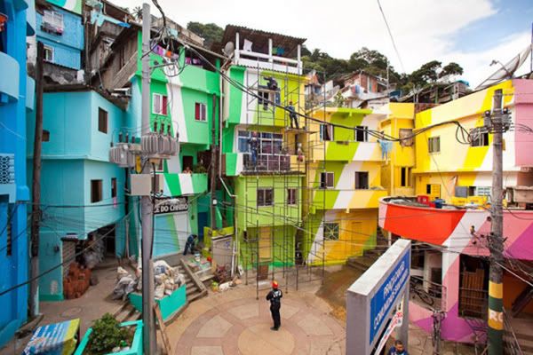
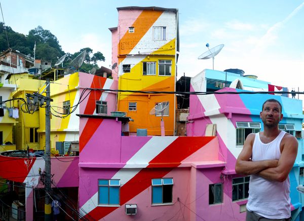
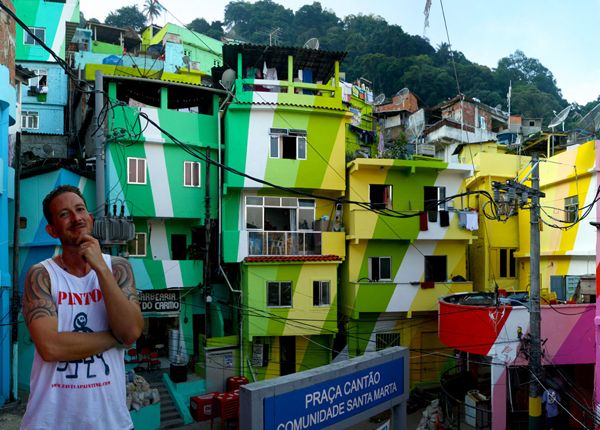
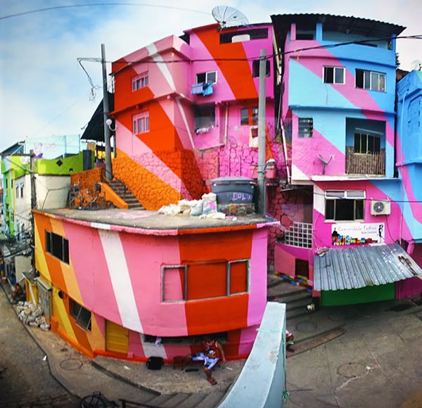
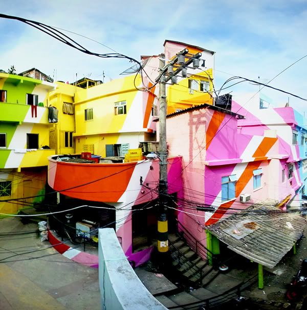
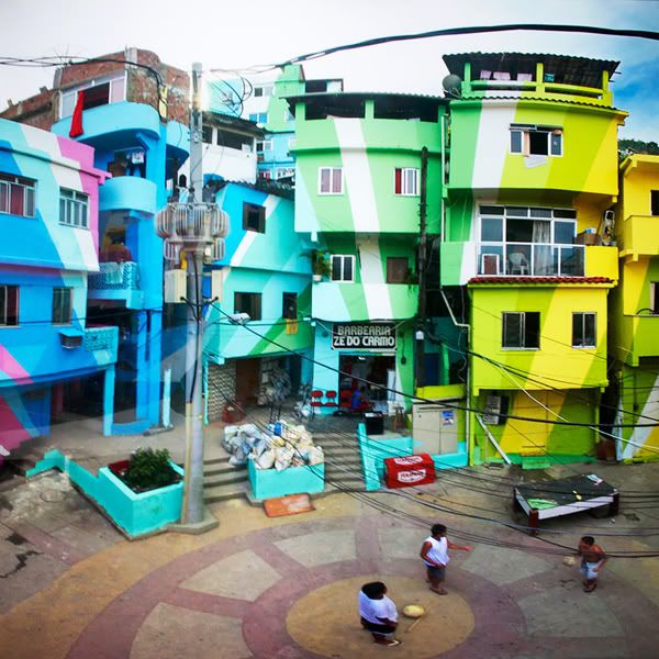
Straight on the heels of Dottie’s wonderful post about the Color Corp Project in Oakland, California, I thought it would be cool to take a look at a similar project that is already completed. The Favela Painting Project in Brazil is simply stunning. A favela is a Brazilian slum. Most of the buildings are run down and neglected. The Favela Painting Project has made it their mission to create striking artwork in these neighborhoods by collaborating with the local people—and using art as a tool to “inspire, create beauty, combat prejudice and attract attention”. Not a bad mission in my book!

“Sequestered within the city of Rio de Janeiro, two men are giving the poor, compact community of Santa Marta a radiant makeover. Dutch duo Jeroen Koolhaas and Dre Urhahn originally came to the favelas of Brazil in 2005 to film a documentary about hip hop for MTV, but after MTV left, they decided to stay. Soon after, the Dutch duo (known simply as Haas&Hahn) began Favela Painting, an organization dedicated to bringing outrageous works of art to unexpected places.”  — Flavorwire

Can you imagine your neighborhood being transformed like this? Pretty glorious!

Vintage Bookshelf :: Black + White and Pink all Over.


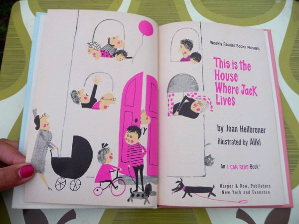
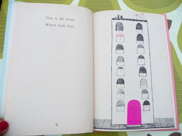
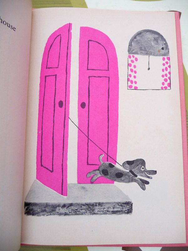
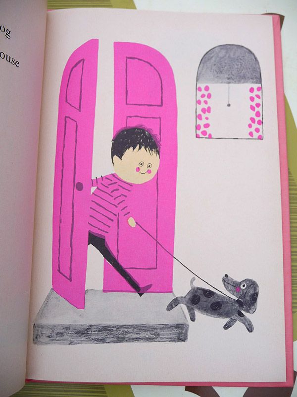
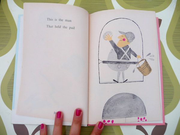
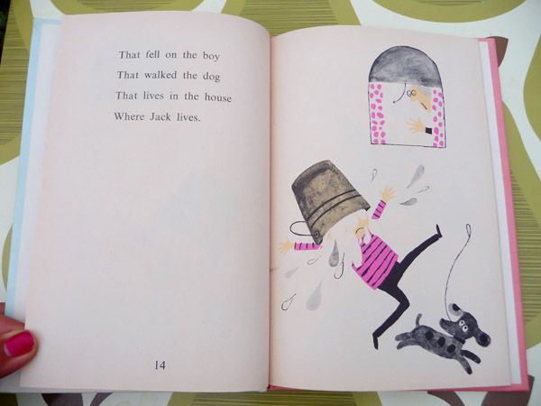
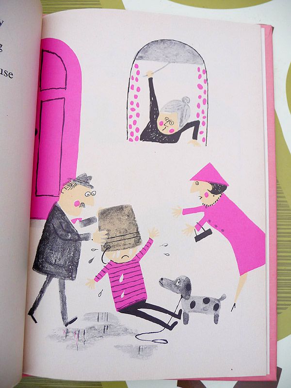
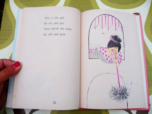
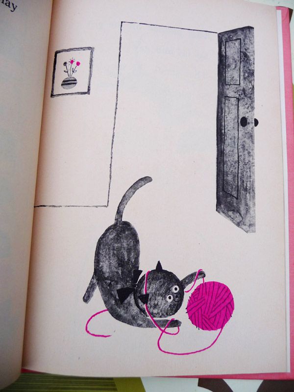
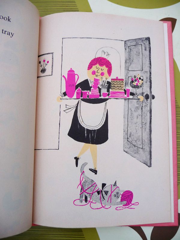
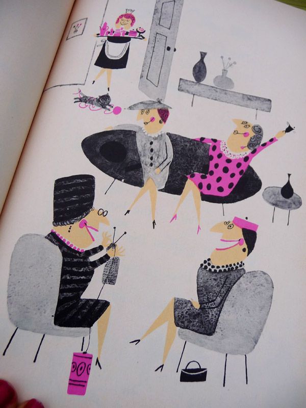
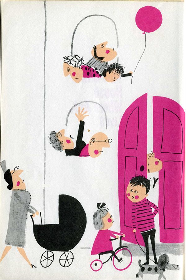
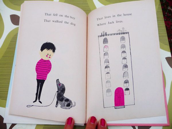
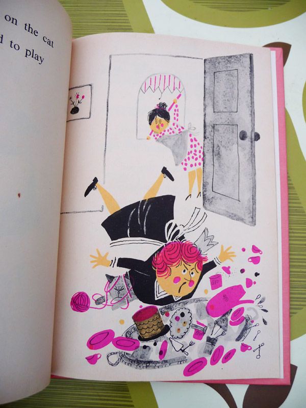
Most of the vintage children’s books I show off have luscious rich illustrations—in bold colors and jewel tones that I just love! But for a little twist, I thought it would be fun to take a look at a more parred down book. What happens when the illustrations get a bit simpler? Say…..black and white. I  have a few books like this with just a hint of color and honestly,  they are every bit as excellent as the colorful ones. Let’s take a look!

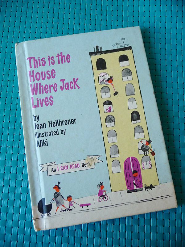
Ahhh, I love how clean and simple the colors in this book look. Just black, white and a splash of pink. But oh what a splash it is! It just goes to show you how effective even the teensiest bit of color can be!

Hurray!

This is the House Where Jack Lives. By Joan Heilbronner. Illustrations by the marvelous Aliki. 1962.

{PS Sorry the photos are a little wonky…oddly enough, the colors were really hard to capture—they grey kept blowing out on me!}